Super Force Signals - A Leading
Market Timing Service
We Take Every Trade Ourselves
Gold Tests The Floor
Morris Hubbartt
Weekly Market Update Excerpt
posted Jun 8, 2012
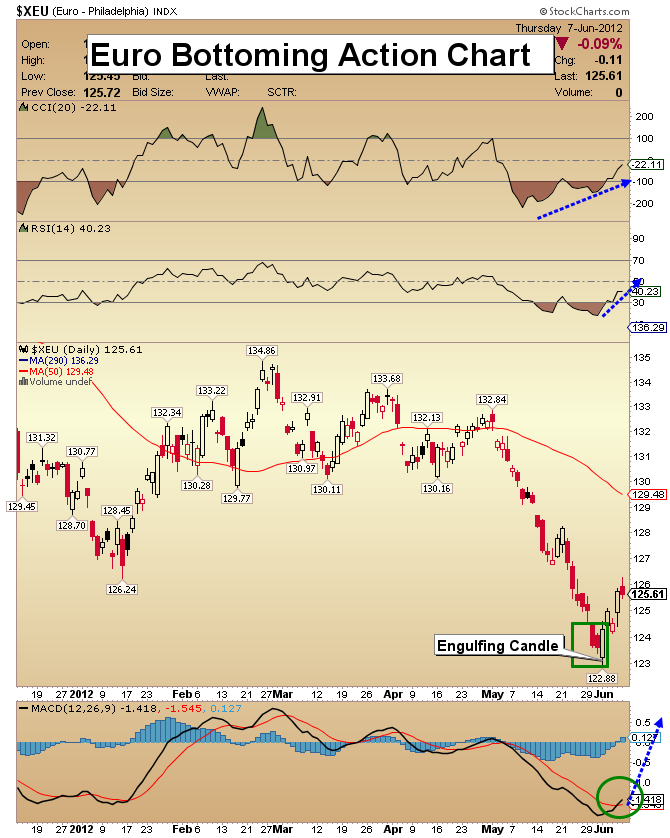
Euro Head & Shoulders Chart
- I’m focusing a lot of attention on the euro. Last Friday, an important technical formation developed. The formation is called an “engulfing candlestick”.
- The bullish engulfing candle formation is generally a fairly dependable indicator that a low could be in place. The bigger the previous day’s candle being engulfed, the more effective the new trend signal will be.
- The appearance of this particular engulfing candle is a very positive event because it engulfed both of the two previous trading days.
- Additional technical evidence that the long-term health of the euro is intact is the enormous commitment of capital placed into it by commercial traders.
- Most importantly, a rising euro could have a very positive effect on the price of gold.
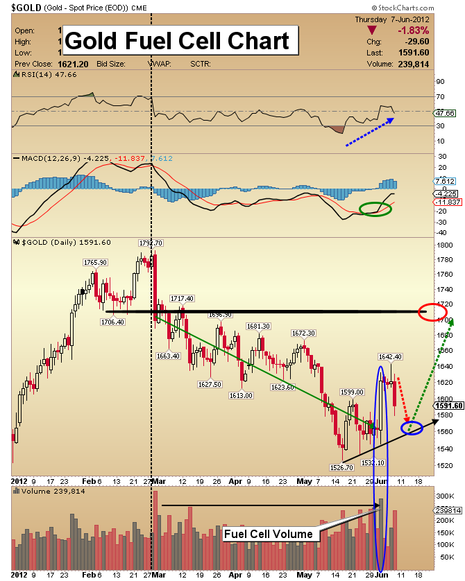
Gold Fuel Cell Chart
- One indication of a probable bottom in gold stocks several weeks ago was my “Fuel Cell Volume” (FCV) Indicator. From the time the FCV occurred, gold stocks gained about 20%.
- This particular indicator is most effective after a long decline in price. The best FCV indicators happen after price moves lower for an extended period of time. Then, a strong “up day” comes on the heaviest trading volume seen in many weeks.
- Up until last Friday, GDX (mainly senior gold stocks) was the only sector of the precious metals complex to recently display such volume. Friday’s trading was a “game changer”. It produced an impressive FCV indicator for gold and silver.
- My work had been suggesting that if the bottom isn’t in for gold it is very close. This indicator and the size of the price move appear to have put a floor under the gold market.
- Now we have to show the patience to deal with some serious testing of that floor.
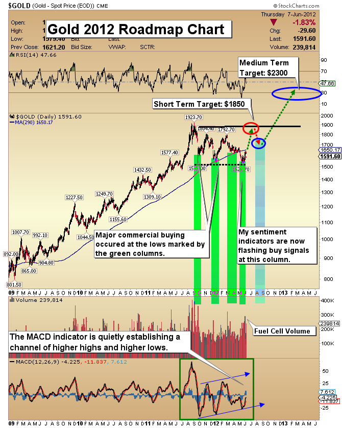
Gold Road Map Chart
- The above road map chart for gold projected that a day like last Friday was coming.
- The basis of the roadmap chart is the trading action of the commercial buyers in gold and silver. Note the green columns. They highlight areas of large buying.
- I’ve never seen such a bullish display of market action by these buyers. The buying has probably continued during the past 48 hours as the lows get tested.
- After the test of the lows is successfully completed, my next upside target is $1850. That rise should be followed by a sharp sell-off, and then gold could surge to $2300. Hold your positions or buy more on this test of the lows.
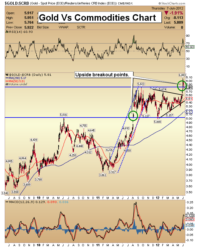
Gold Vs Commodities Chart
- This chart displays gold’s performance against the CRB index. That index is a basket of many commodities. Gold’s price rise is accelerating against most commodities, leading to a decrease in the costs of equipment and energy used in mining.
- This event makes mining stocks more attractive.
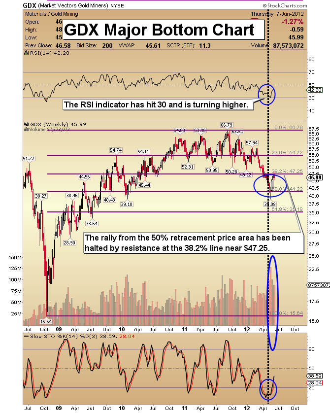
GDX Major Bottom Chart
- I want to look at several charts in reviewing the very bullish action taking place in the gold stock sector. The current action of the GDX price at the long term Fibonacci retracement lines is very encouraging.
- Gold stocks passed a critical test by closing above the 50% retracement level at the end of last month. This was an important test for gold stocks.
- GDX is recoiling from the 38.2% retracement line. I’m projecting that a test of the lows will be followed by rise towards the $54.72 price at the 23.6% retracement marker.
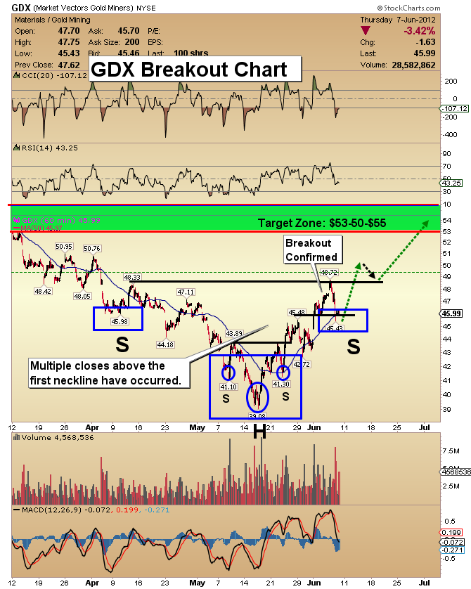
GDX Breakout Chart
- The next chart I want you to examine is the GDX 60 minute breakout chart. The upside targets I set two weeks ago have been acquired. On Tuesday, an important milestone was achieved by holding the neckline area of $47.10 for two consecutive trading days.
- The next upside target zone is $53.50-$55. My time target analysis projects that GDX could acquire that price area by around the 3rd week in July. That means that his market could test the bottom and consolidate in this area for quite a few weeks.
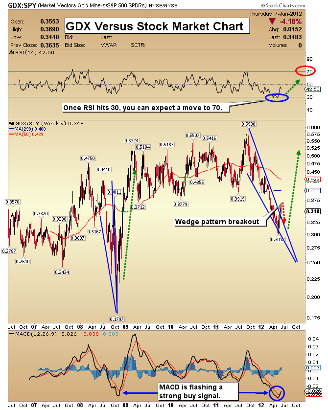
GDX Vs Stock Market Chart
- Several weeks ago I began talking about the stock market in comparison to gold stocks. I projected that gold stocks would begin to outperform the general equity market.
- GDX has broken out to the upside from the falling wedge that I’ve highlighted on the chart. It’s a very positive development. The long term value of gold stocks is compelling. I believe the time is approaching when gold stocks become the best performing sector in the entire market.
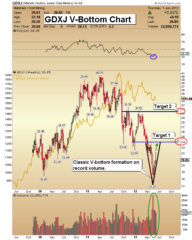
GDXJ V-Bottom Chart
- The only way to find more gold is through exploration. In the later stages of a bull market, juniors stocks tend to perform best, and this gold bull market is no exception to the rule.
- Senior mining companies will buy up many junior companies, and that buying could put strong upwards pressure on prices.
- My favorite strategy to gain diversified exposure to small and medium gold mining companies is to buy and hold GDXJ, for long-term capital appreciation.
- GDXJ now shows a sharp V-bottom formation on the chart. That formation indicates that an explosive move higher could commence very quickly.
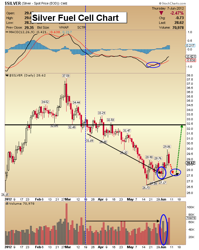
Silver Fuel Cell Chart
- Silver is one of my favorite investments, and the recent “Fuel Cell Volume” (FCV) indicator created one more good reason to own this mighty metal.
- Although the FCV for silver was not as strong as the same indicator was for gold, it is still a very encouraging sign for silver bulls.
- Silver tends to begin big rallies more tentatively than gold does. It gains momentum as the rally continues. My technical work continues to point to late 2012 as the timeframe that produces the biggest upside action in silver. Longer term, silver is my favorite investment to hold for retirement.
Friday, Jul 10, 2026 Super Force Signals Unique Introduction For 321Gold Readers:
Send me an email to admin@supergoldsignals.com and I’ll send you my free “Inflation Thunder Now!” gold and silver stocks video report. I’ll also include 3 of my next Super Force Surge Signals free of charge, as I send them to paid subscribers. Thank you!
|
Stay alert for our Super Gold alerts, sent by email to subscribers,
for both the daily charts on Super Force Signals at www.supergoldsignals.com and for the 60 minute
charts at www.supergoldsignals.com
About Super
Gold Signals:
Our Surge Gold Signals are created thru our proprietary blend
of the highest quality technical analysis and many years of successful
business building. We are two business owners with excellent synergy.
We understand risk and reward. Our subscribers are generally successfully
business owners, people like yourself with speculative funds,
looking for serious management of your risk and reward in the
market.
Frank Johnson:
Executive Editor, Macro Risk Manager.
Morris Hubbartt: Chief Market Analyst, Trading Risk Specialist.
website: www.supergoldsignals.com
email:
admin@supergoldsignals.com
email: admin@supergold60.com
Mail:
1276 Lakeview Drive
Oakville, Ontario, L6H 2M8
Canada
###
Jun 8, 2012
Morris Hubbartt
321gold
Ltd

|
