Super Force Signals - A Leading
Market Timing Service
We Take Every Trade Ourselves
The Bouncing Fibonacci Ball
Morris Hubbartt
Weekly Market Update Excerpt
posted May 11, 2012
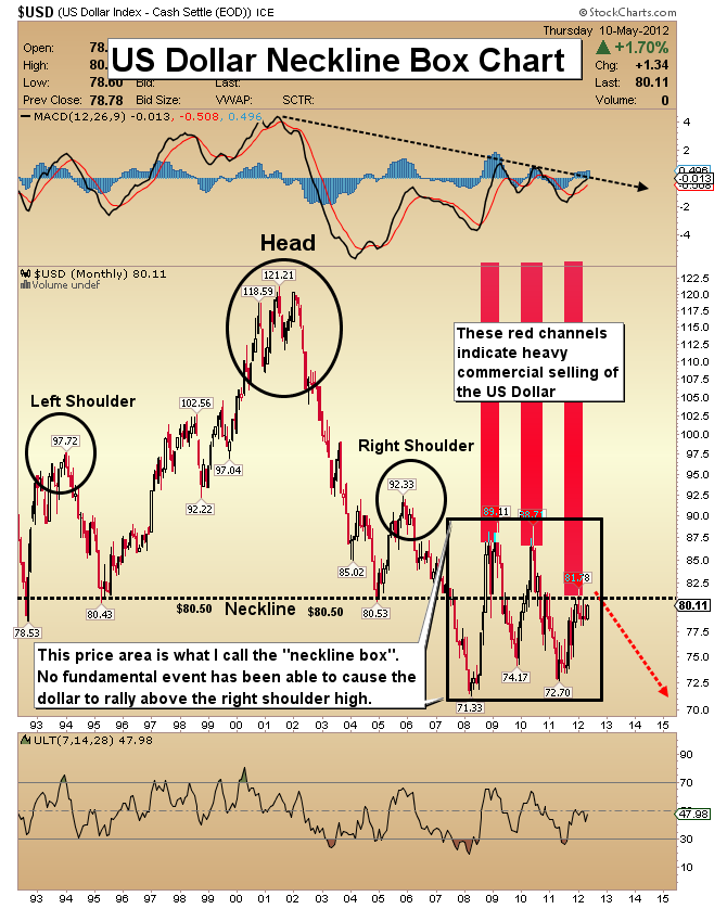
US Dollar Neckline Box Chart
- How does one interpret the action of the dollar? It’s clear that the economy hasn’t created enough jobs to sustain growth or stop the mounting deficits. If the economy is now weakening, the mounting US debt problem will continue to plague a dollar that is already mired in a long term bear market.
- The situation in Europe brings an expectation of help for the dollar. Even with socialists taking power in France and further destabilizing the future of the euro, the dollar shows low trading volume. If the dollar can only rally slightly on news that the euro could be finished, serious questions arise for the dollar. All roads in this crisis lead to gold. Gold is my most preferred asset, now more than ever.
- Note the black box on the chart. The dollar fell to 71.33 in early 2008. The lows in that box have not been bought that heavily by commercial traders, but the highs have been very heavily sold and shorted.
- It will be extremely important to see how the commercial group reacted to the latest tumble in the euro. I suspect the next COT report will indicate that they have bought the euro and shorted the dollar fairly heavily.
- The dollar has yet to trade above the right shoulder high at 92.33. I believe the current low-volume rally could end by May 16, which is next Wednesday. It’s an important date, because the latest FOMC meeting minutes will be released then.
- Look at the enormous size of the head & shoulders pattern on this chart. It’s important to understand how big these timeframes are. The “neckline box” covers four years of time. This chart indicates that something big lies ahead that will trigger a final move out of the box.
- The head & shoulders pattern indicates that the move will be to the downside, and even a rally towards the 90 area would have no effect on the overall picture.
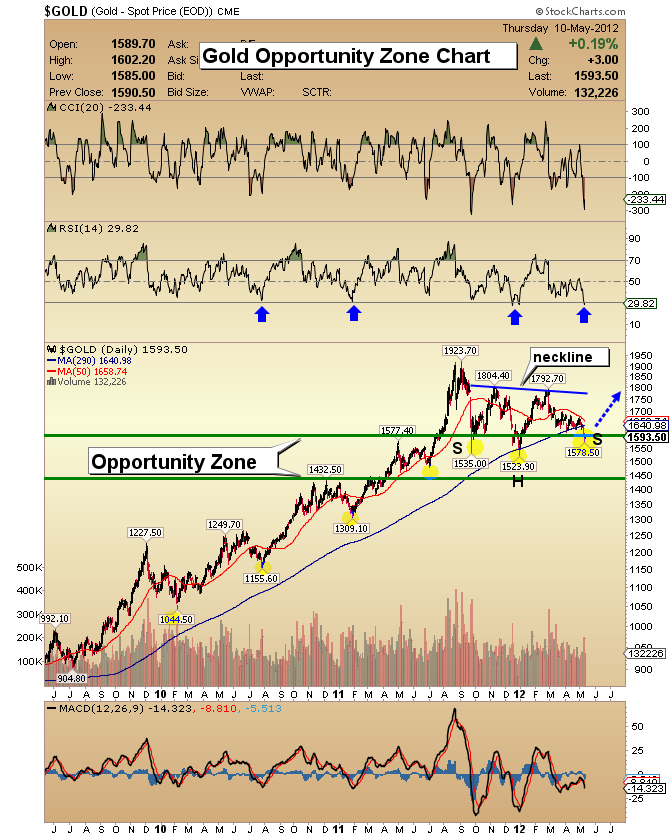
Gold Opportunity Zone Chart
- The fundamental case for gold ownership increases with the printing of more fiat currency. This chart simply lays out where there is solid technical support for gold. Prices inside the support zone are places to allocate additional dollars into gold.
- I have mentioned in recent weeks that if the bottom in gold bullion was not in, it was likely very close to being in, because of substantial buying from commercial traders. The gold market did move lower this week. Sentiment indicators indicate that gold is substantially oversold.
- If you are already fully invested, there is nothing to do inside the opportunity zone except be patient.
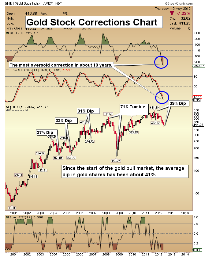
Gold Stock Corrections Chart
- There is one word to explain the feelings of gold stock investors over the last several weeks and that is “pain”. This HUI Gold Bugs index chart identifies other painful corrections during the gold bull market, dating back to 2001.
- Most of those corrections were similar to the current pullback. In hindsight, they look pretty normal, and so will this one. Gold stocks are incredibly volatile, even in the best of times. Because this is the first correction since the market debacle of 2008, it feels more severe and frightening. In the big picture, the current selloff is probably more of a dip than a debacle.
- Some technical indicators and oscillators are now more oversold than any other time in the history of this gold bull market. For more evidence that this is not a 2008 type of debacle just getting underway, please view the next chart.
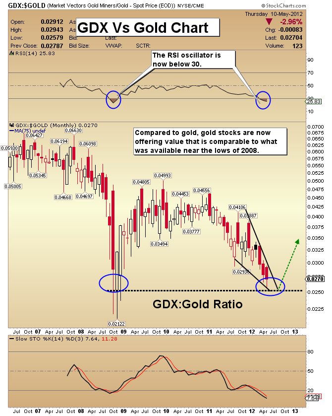
GDX Versus Gold Chart
- This chart is a ratio of GDX against gold. When the price on this chart is falling, gold stocks are underperforming gold. As you can see, gold stocks have been badly lagging gold.
- The ratio is now as low as it was at the market bottom of 2008, and RSI is too.
- Most good gold analysts see the value in gold stocks. The ultimate bottom has been elusive, but the technical condition of the market does not suggest a crash is coming. It suggests good value.
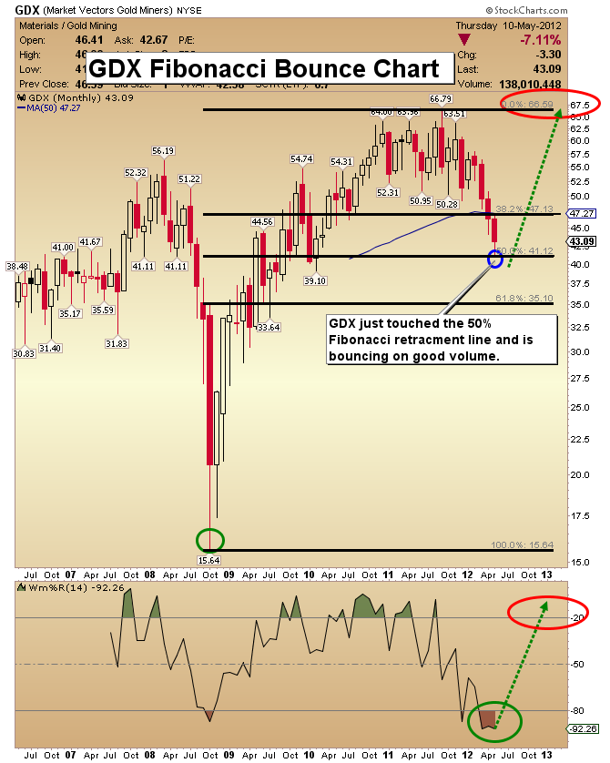
GDX Fibonacci Bounce Chart
- GDX almost hit my $41 “bear case” target this week, which was based on the Fibonacci 50% retracement of the rise from the lows of 2008.
- There are typically good rallies from this key Fibonacci number.
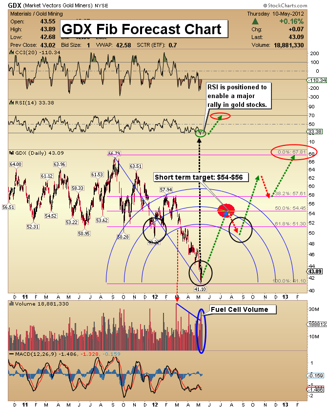
GDX Fib Forecast Chart
- Wednesday was an important day, technically. There was fuel cell volume and an engulfing candle. I have set a $54-$56 short term trading target.
- The target area represents a 50% retracement of the decline from $66.79 to $41.10.
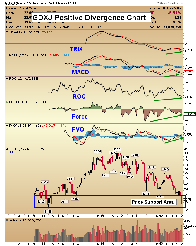
GDXJ Divergence Chart
- The price of junior gold stocks have come down substantially since the highs of last summer. Juniors are my favorite sector for outstanding value and capital gains over the next several years.
- There are a lot of positive technical divergences happening now, as you can see on this chart. PVO and Force are particularly striking.
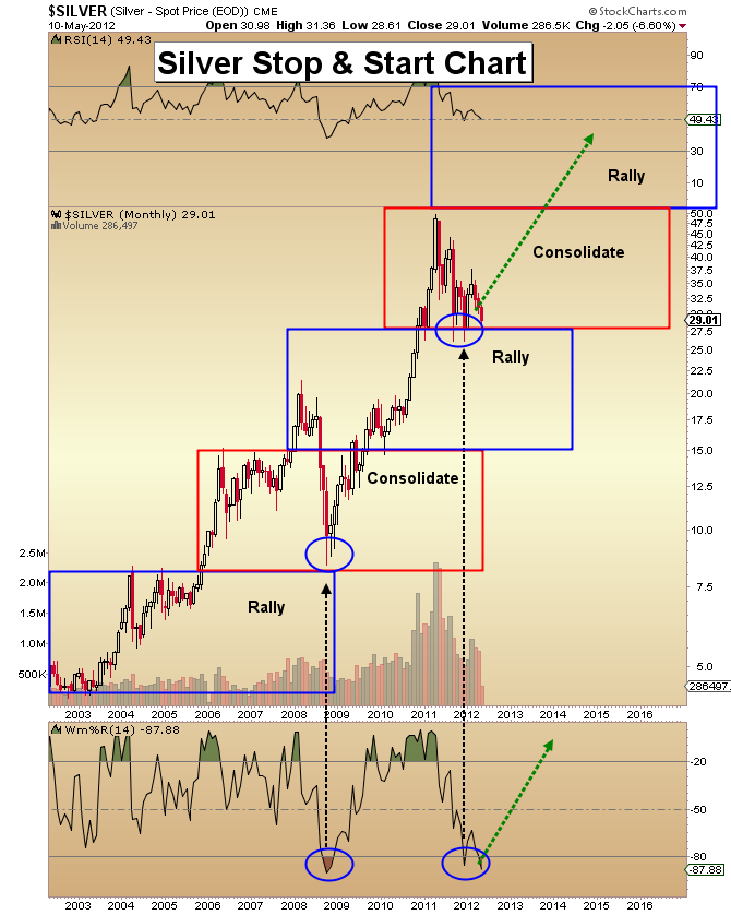
Silver Stop & Start Chart
- One of Jesse Livermore’s famous sayings is rumored to be, “Be right and sit tight!”. I think those words of wisdom are essential for today’s silver investor. The fundamentals for silver are excellent, but the lack of upside action is frustrating.
- If you look at the chart carefully, you can see that most of the time the price is consolidating. The moves to the upside are short but sweet.
- Volume continues to decline gracefully in this correction. The dramatically oversold position of the Williams indicator should not be overlooked.
- The overbought condition created on the move towards $50 is being worked off. I issued a fresh buy signal on Wednesday. Physical metal should be your preferred method of owning silver!
Friday, Jul 3, 2026 Super Force Signals Unique Introduction For 321Gold Readers:
Send me an email to admin@supergoldsignals.com and I’ll send you my free “Inflation Thunder Now!” gold and silver stocks video report. I’ll also include 3 of my next Super Force Surge Signals free of charge, as I send them to paid subscribers. Thank you!
|
Stay alert for our Super Gold alerts, sent by email to subscribers,
for both the daily charts on Super Force Signals at www.supergoldsignals.com and for the 60 minute
charts at www.supergoldsignals.com
About Super
Gold Signals:
Our Surge Gold Signals are created thru our proprietary blend
of the highest quality technical analysis and many years of successful
business building. We are two business owners with excellent synergy.
We understand risk and reward. Our subscribers are generally successfully
business owners, people like yourself with speculative funds,
looking for serious management of your risk and reward in the
market.
Frank Johnson:
Executive Editor, Macro Risk Manager.
Morris Hubbartt: Chief Market Analyst, Trading Risk Specialist.
website: www.supergoldsignals.com
email:
admin@supergoldsignals.com
email: admin@supergold60.com
Mail:
1276 Lakeview Drive
Oakville, Ontario, L6H 2M8
Canada
###
May 11, 2012
Morris Hubbartt
321gold
Ltd

|
