Super Force Signals - A Leading
Market Timing Service
We Take Every Trade Ourselves
Mine Problems Don't Fix America's Debt
Morris Hubbartt
Weekly Market Update Excerpt
posted May 4, 2012
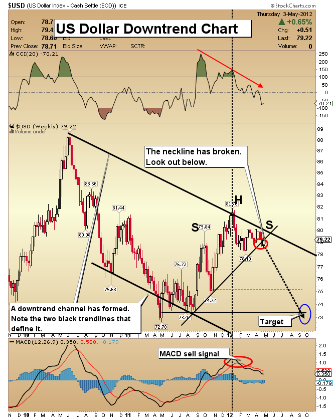
US Dollar Downtrend Chart
- It’s been an extraordinary week. Gold and gold shares were disappointing, but the dollar went nowhere.
- The Fed has made it clear they are prepared to do more to make sure the recovery stays on target. Additional stimulus is still very much on the table, and the recent positive economic numbers are quickly becoming ancient history.
- Note the big jump in foreclosure activity in large cities like New York. This increase pushed the national numbers higher in the first quarter of this year, according to a report from RealtyTrac, an online foreclosure sales and data company. Please click this link now to view their report.
- The most recent GDP numbers show disappointing growth for the overall economy, and dismal job creation in the private sector was reported on Wednesday. These reports are not the foundation of a strong economy.
- It’s clear that the Fed knows there is very little meaningful growth in the economy. Money printing is the tool they use to keep the economy from sinking to new lows. Their actions make gold the best way to store your wealth.
- Note the new downtrend channel that I have highlighted on the chart with black trend lines. A large head and shoulders top pattern sits at the upper trend line, and the neckline has been broken. It will be very difficult for the currency of the world’s largest debtor nation to mount a significant rally from here.
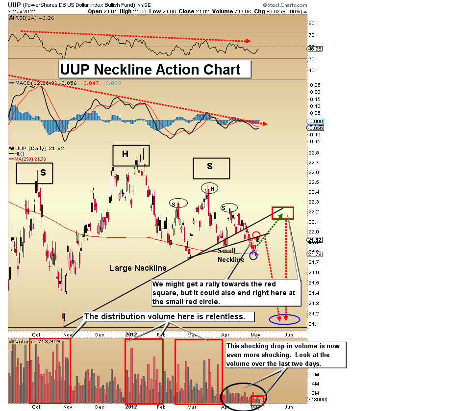
UUP (US Dollar Proxy) Neckline Action Chart
- This daily chart gives you a closer look at the action around the neckline. It illustrates how close the US dollar may be to a major breakdown. Such a move could generate an “all clear” signal for gold.
- Look for a move back to the neckline followed by a decisive failure. From there, I see a descent to much lower prices. MACD and RSI are very weak and in a general downtrend.
- I’d like you to look very closely at the current rally. Volume has dried up dramatically, and over the past two trading days it is almost invisible.
- Don’t let problems at Goldcorp’s mine cloud the big picture you have for gold or the US dollar; America has gone from being the world’s largest creditor nation to the largest debtor nation in the history of the world, and this neckline action chart clearly illustrates that situation.
- There has been a clear breakdown from the necklines of two H&S top patterns. Pullbacks to the neckline after a breakdown are textbook price action. The small red circle on the price chart highlights the pullback to the small H&S neckline.
- The red square indicates where the price could rally to on a pullback to the large H&S neckline.
- Because the volume is so terrible, it’s possible that the price could collapse right here.
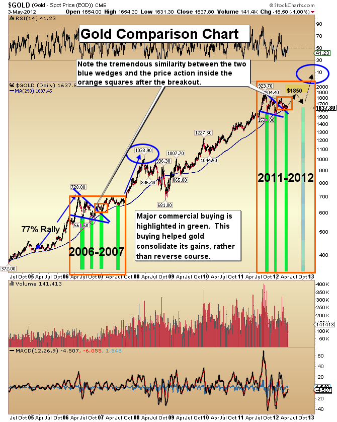
Gold Comparison Chart
- The major trend for gold is up, and a renewed rally appears to be imminent. Today I’d like you to look carefully at the tremendous similarity between the consolidation in 2006 and the present action on the chart.
- In both cases a large wedge pattern formed. In both cases there was an upside breakout. That has been followed by a gentle decline along the top of the upper trend line. I’ve highlighted that price action in small orange squares.
- The Commitment of Traders (COT) report shows the commercial buyers covering large amounts of short positions and adding to their longs in 2006, and during this consolidation.
- In the short term, my focus is a rise towards $1850. From there, look for a shallow pullback. Once the $1850 target is acquired and the pullback is complete, the gold market should be ready to make an assault on all-time highs.
- I expect gold will rise to $2100, followed by further spike to $2400. My technical analysis indicates there is an outside chance that gold reaches $2800 by March of 2013.
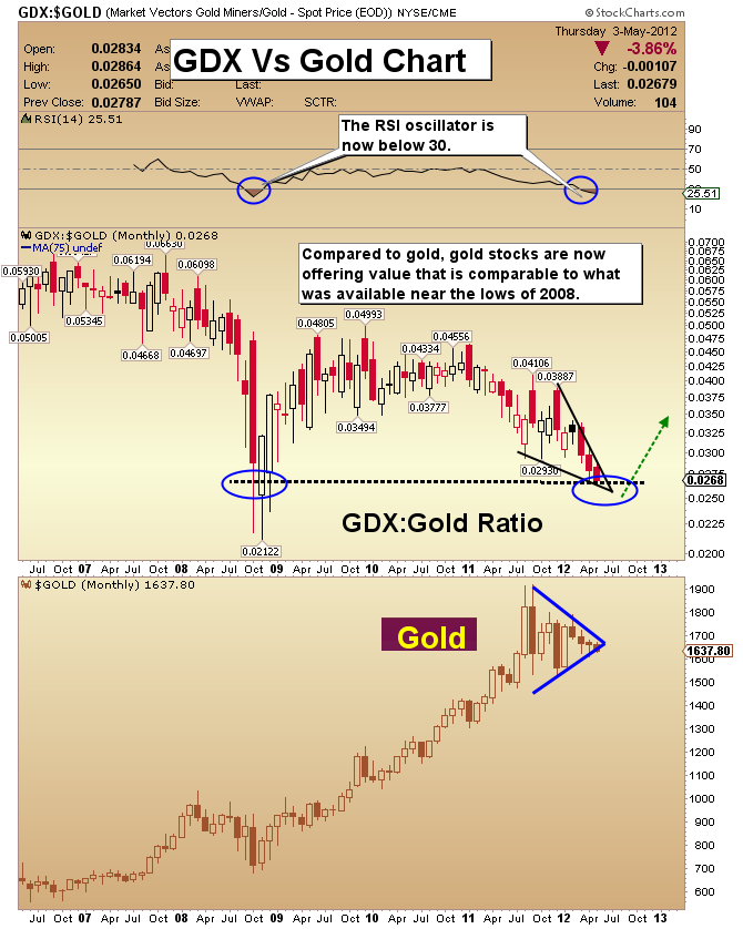
GDX Vs Gold Chart
- As I have written here for weeks, my charts indicate that you need to be prepared for GDX to go as low as $41. Although I don’t expect that to happen, being prepared for such an event makes sense.
- Another thing to be careful about with gold stocks is leverage. Leverage is not really needed when investing in gold stocks because mining companies are already leveraged to the price of gold. In my SFS and SF60 trading services I do use NUGT-nyse, which is a triple-leveraged fund. I advocate using this type of vehicle as an option-replacement strategy, meaning that you invest only tiny amounts of capital into it.
- Compared to gold, GDX is now valued comparably to how it was near the lows of 2008. Hold your positions and accumulate more if you can.
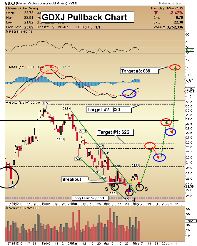
GDXJ Pullback Chart
- In the precious metals sector, we are witnessing a budding outperformance by junior gold stocks. This adds evidence to the argument that a bottom in the precious metals sector is nearly in.
- Note the wedge breakout on the chart. Now a pullback has started, which is textbook price action. Once the pullback period is completed, we should be looking at the $26 target area.
- Notice how the breakout and pullback from the green wedge pattern has formed a small H&S bottom pattern. That’s a bullish development.
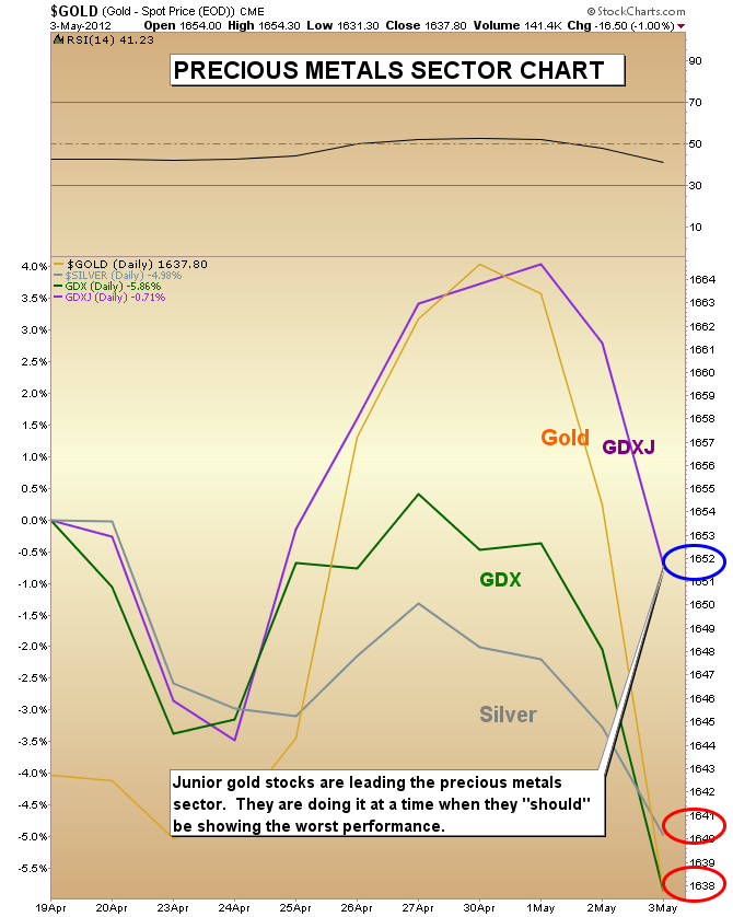
Precious Metals Sector Chart
- This is a very short term chart that highlights the strange outperformance of junior gold stocks recently. I think this is the beginning of a new trend.
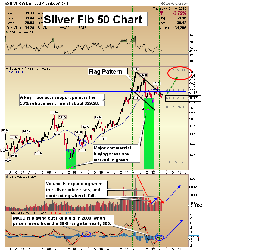
Silver Fib 50 Chart
- Silver is my second largest holding. The value of this metal is extraordinary at these levels from a long term perspective.
- From a trading perspective, I see the strongest performance unfolding during the fall season this year.
- The silver short is almost technically perfect, in my opinion. There’s a large flag pattern, and the volume pattern confirms the price action.
- Commercial traders went to 63,000 long positions according to the latest COT report, and they may have accumulated even more longs this week. I believe that 63,000 longs is a record, but the main point is that is very bullish for silver prices.
- The Fibonacci 50% retracement line sits at about $29.28, and we are very close to that support level now. The “Fib 50” support area is exciting because large rallies can begin from this level!
Friday, Jul 3, 2026 Super Force Signals Unique Introduction For 321Gold Readers:
Send me an email to admin@supergoldsignals.com and I’ll send you my free “Inflation Thunder Now!” gold and silver stocks video report. I’ll also include 3 of my next Super Force Surge Signals free of charge, as I send them to paid subscribers. Thank you!
|
Stay alert for our Super Gold alerts, sent by email to subscribers,
for both the daily charts on Super Force Signals at www.supergoldsignals.com and for the 60 minute
charts at www.supergoldsignals.com
About Super
Gold Signals:
Our Surge Gold Signals are created thru our proprietary blend
of the highest quality technical analysis and many years of successful
business building. We are two business owners with excellent synergy.
We understand risk and reward. Our subscribers are generally successfully
business owners, people like yourself with speculative funds,
looking for serious management of your risk and reward in the
market.
Frank Johnson:
Executive Editor, Macro Risk Manager.
Morris Hubbartt: Chief Market Analyst, Trading Risk Specialist.
website: www.supergoldsignals.com
email:
admin@supergoldsignals.com
email: admin@supergold60.com
Mail:
1276 Lakeview Drive
Oakville, Ontario, L6H 2M8
Canada
###
May 4, 2012
Morris Hubbartt
321gold
Ltd

|
