|
|||
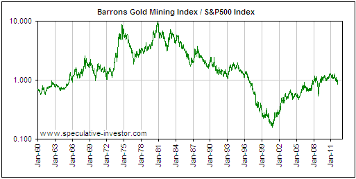
Gold stocks versus the stock marketSteve Saville Below is an excerpt from a commentary originally posted at www.speculative-investor.com on 29th March 2012. When reviewing the long-term performance of the gold sector in previous TSI commentaries we looked at performance in nominal dollar terms and in gold terms, but as far as we can recall we never looked at performance relative to the broad stock market. This is an omission we are now going to rectify. The following weekly chart shows how the Barrons Gold Mining Index (BGMI) performed relative to the broad US stock market (as represented by the S&P500 Index) from 1960 through to this week. Clearly apparent on this chart is the secular bull market in gold-stock relative strength of the 1960s and 1970s, the secular bear market in gold-stock relative strength of the 1980s and 1990s, and the secular bull market in gold-stock relative strength that began in 2000. Also clearly apparent on this chart is that the secular trends contain many counter-trend moves. During the gold secular bull market of the 1960s and 1970s these counter-trend moves were sometimes dramatic and lasted more than two years. During the current secular bull market the counter-trend moves have been far less impressive, but even though they look trivial on the long-term chart they can still feel dramatic in real time.
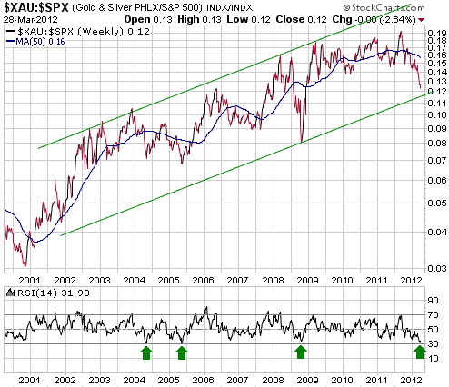
The next weekly chart zooms in on the current secular bull market in gold-stock relative strength, but note that it uses the XAU rather than the BGMI to represent the gold sector. The switch from the BGMI to the XAU was done for convenience and doesn't make a significant difference to the pattern. The chart shows that there have been several intermediate-term corrections in gold-stock relative strength over the past 12 years, the most notable being the 18-month correction that began in December of 2003, the 15-month correction that began in May of 2006, and the steep 7-month correction that began in March of 2008. The current correction has lasted 7 months to date and certainly qualifies as the intermediate-term variety. The chart also shows that the XAU/SPX's weekly RSI hit its lowest levels of the past 12 years in May-2004 and May-2005, and that its current level is close to these prior lows.
The performance of the XAU/SPX ratio over the past several months looks most similar to its performance during the months leading up to the May-2004 bottom. The May-2004 bottom was followed by a strong multi-month rebound, although it didn't turn out to be the ultimate correction low. ### Steve Saville Regular financial market forecasts and analyses are provided at our web site: We aren't offering a free trial subscription at this time, but free samples of our work (excerpts from our regular commentaries) can be viewed at: http://tsi-blog.com Saville Archives 321gold Ltd |