|
|||||||
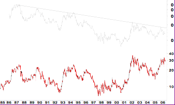
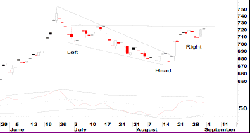
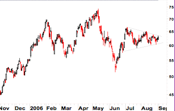
Gold... the missing ingredient from the garlic dietDr. Clive Roffey South Africa, pariah of the global AIDS conference, self confessed leader of the AIDS pandemic, inventor of the cure all garlic and beetroot diet for AIDS and leader of the world's Minister of Health idiots has suddenly decided that there was a missing ingredient from the garlic diet... gold! The latest missive is that you must eat gold to prevent AIDS. Well, I love this concept. Several million people eating gold every day and the gold price will soar to unimaginable heights. The fact that most of the AIDS sufferers can only just find enough food to keep them alive is beyond the grasp of our beloved politicians. I presume that some beneficent fund will be established to buy gold for these AIDS victims but in reality will be used to pay for more jaunts overseas for various grabbing Ministers. As I keep telling my friends and family, you must have a sense of humour to live in South Africa because if you take it too seriously you will end up a nervous dribbling wreck in some under funded nursing home for insane political refugees eating the garlic and beetroot diet, with gold condiments of course. I apologize for the shortened version of this week's data. I spent the whole of last week preparing for the technical analysis seminar that I held on Saturday. Standing for 8 hours solidly delivering the data is a little taxing. By Saturday night I was foot sore and quite hoarse. However, judging by the emails since received it was very well accepted and all participants learned a lot about technical analysis that is not available in the books. Bullion has broken above the critical $624 resistance and now needs to follow through with a break above $635. This is the final resistance that is standing in the way of the completion of the large triangular pattern that has been in force for the past three months. In the last issue I detailed that I was looking for a pullback in the oil price to test the $68 support. The price has drifted back to $69 but looks ready to reverse this minor downtrend. But the most interesting aspect of global equity movement is the push by the Dow to test the 11 500 resistance level. There are so many chartists looking at this breakout into new bull territory that I am beginning to wonder if this is not a self fulfilling event. For some reason my data still does not look convincing and I will remain suspicious of any upside breakout until the trend has been proved. During the past two weeks I have given two presentations that included analyses of the gold market. One of the most powerful sets of data to emerge from this preparation is the relative strength of the various gold indexes relative to the gold price. For over a decade the indexes have underperformed the gold price but there is every indication that this is about to change. There are very long term downtrends that are ready to be penetrated. Once this occurs it has some dramatic implications. Whilst the gold shares remain under the resistance line it indicates that the general interest in the gold shares remains a function of the movement of the gold price. But once the breakout occurs it implies that the shares will not only outperform bullion but that a complete change of attitude towards gold stocks is likely. The other aspect of this data is that a move out of the negative performance trend will be a break in a very long term trend and that this will lead to a long term period of gold stock out performance. One of the aspects that will drive the gold market when it move into its next bullish drive will be the resources underground that can be easily brought to mining capability. So that development stocks with the potential to finance and develop gold production will become the most sought after shares. In this context Harmony has the largest resources of any gold mine and I must look to this stock to become a market leader in the next phase. I detail this in a different type of chart. Once again please forgive the shortened data this week as I try to catch up with all my work and some sleep. 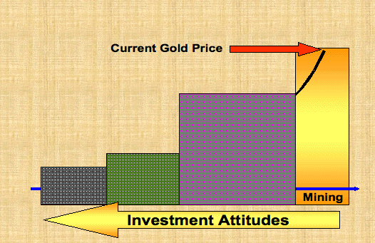 Let me explain this data. There is an exponential curve in black that represents the affect on value of gold price movement in the various categories. The Resources block on the left represents companies that have proven gold underground resources that are not likely to be developed at current gold prices. The black line in this block hardly moves as any increase in the gold price has very little effect on their bottom line value and hence share price. As the market moves into the second block of Feasibility the black line starts to increase in view of the transition of the underground gold resources closer to actual development and mining. The more positive the Feasibility studies the more attractive is the share. However potential investors need to be very wary in this phase as there are real feasibility studies and many rather wishful presentations. Real acceleration of the black line only starts when the Development phase is reached in which the money and expertise for development has been obtained and actual infrastructure and mining become a longer term reality. The value of the underground gold starts to assume an important part of the company value and hence the share price starts to accelerate. The closer the mine comes to actual production the more value is added to the underground resources and the share price reflects this increase in value. Finally the Mining block represents the final move to actual mining and production where the share price becomes a function of the operational costs relative to the increase in the gold price. The yellow arrow represents investor interest. As the gold price increases investors tend more towards the resources area than the mines producing gold. Ultimately the final stages of a long term gold bull market will reflect the NASDAQ dot.com bubble where the big miners will be discarded in favour of the Resource and Feasibility stocks as they are the ones that represent potential growth. Earnings, dividends and value will be thrown out of the window in favour of the underground potential of those shares with large resources. The search for resources by the big miners will also drive the prices of many of the more substantial resource stocks that are currently sitting in the penny stock category. 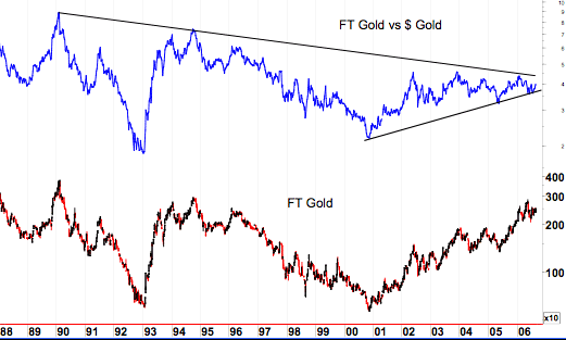 I regard the above FT Gold vs $ Gold chart as one of the most important aspects of the gold market at this point of time. I like to look at the FT gold index as it covers the whole range of American, African and Australian mines. The FT Gold index in the bottom frame is compared to the $gold price in the top frame. This relative strength picture has been trading inside a long term triangular pattern for the past 16 years. It has effectively traded in concert with the gold price. But an upside breakout is imminent and such a break will have very powerful implications. The movement inside the triangular pattern indicates a total dependency of share price progress on gold price movement. A breakout from the triangle will not only indicate that the gold shares have moved into a long term out performance relative to the gold price, but also trigger a severing of this relationship and push share price movement into a far more independent mode. Such a break will indicate a totally different attitude by global investors, especially fund managers, to gold shares. They will re-rate gold shares relative to future gold prices and base their forecasts on future earnings and not current earnings. There is likely to be an explosion of interest in gold shares once this upside breakout occurs. The interesting aspect is that this same data is to be seen on the charts of ASA and XAU relative to the $ gold price as well as the JSE Gold index relative to the Rand price of gold. I cannot overstate the importance of a breakout from the triangular relative strength pattern and its effect on global attitudes towards investment in gold shares.
Sep 4, 2006 'Gold & Silver Penny Stocks' is the sister publication to 'Gold Action' and is produced by Dr. Clive Roffey; croffey@mweb.co.za
|

