Chart In Focus
Stocks and Polls - Different This Time? McClellan Financial Publications, Inc
Posted Nov 4, 2020 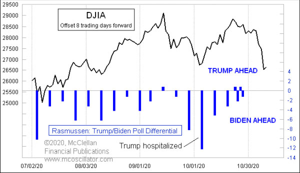
Oct 30, 2020 Since the 2000 election, I have done comparisons of presidential poll numbers and the stock market, which have provided useful insights about how the election was going to turn out. This year, I am not so sure about it working as it has in the past, and for a variety of reasons. This week’s leadoff chart (and I have a bunch more below) compares the DJIA to the Rasmussen poll numbers for the election matchup between President Trump and former Vice President Biden. For most of this year, Rasmussen has done this poll weekly, and they only recently increased the polling frequency to daily. One key adjustment I have made in this chart is that the plot of the DJIA is shifted forward by 8 trading days, to show how the changes in the poll numbers tend to match the movements of the DJIA with a lag. Rasmussen’s poll numbers tipped to one point in Mr. Trump’s favor back on the release dated Sep. 15, which was the echo of the stock market running up to its Sep. 2 top. The stock market’s decline in September led to a big shift back toward Mr. Biden, amplified by Mr. Trump’s hospitalization due to Covid. But since the 12-point differential in the Oct. 6 release, the numbers have moved back to a dead heat. The same 8 trading day lag also works well to explain the movements of the broader poll numbers in the Real Clear Politics (RCP) average, although those numbers show a more consistent edge in favor of Mr. Biden. 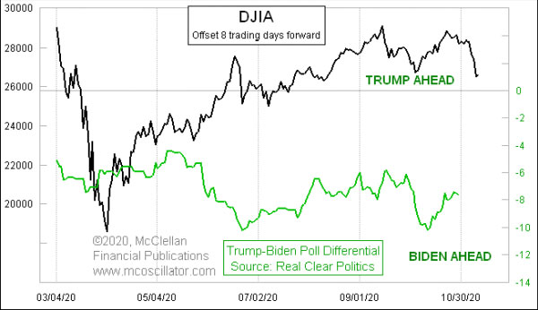
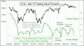
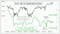
If the 8 trading day lag continues to work, then that would mean a pretty decisive popular vote victory for Mr. Biden, given how the stock market has sold off recently. And that is where we run into trouble about making assumptions. It is not at all clear to me how the actual vote is going to be affected by the recent revelations about Mr. Biden’s son Hunter Biden, and the corrupt dealings with foreign entities. There is also a lot more doubt this year about the validity of any poll result, given the reports about the reluctance of Trump supporters to reveal that support to pollsters. Part of the reason for the lag between the stock market and the polling numbers is that it takes time to conduct a poll, then to assemble the results, and finally to publish them. My belief is that attitudes toward the election vary in real time with attitudes about the stock market, but it just takes us a while to find out what people were thinking. What past years’ analyses have shown is that presidential polls have varied quite a bit all the way up to the election day, along with the variations in the stock market. That insight may not be as useful this year, because the Covid pandemic has increased mail in voting. So even though the public’s attitudes might vary along with the stock market right up until election day, the variation in those attitudes will not matter for the voters who have already sent in their ballots. 4 years ago, the RCP average showed a 3-point margin of victory for Mrs. Clinton in the final data, which turned out to be pretty close to her margin of victory in the popular vote (but as we all remember, not in the electoral college totals). Mr. Trump saw a big late surge, as seen in this comparison: 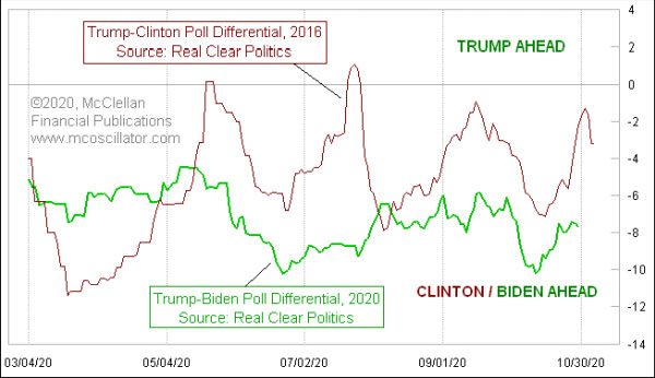
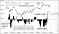
It is rather amazing how the two plots vary together with such amazing similarity. The market is different, and lots of other conditions surrounding the election this time are much different from 2016, and yet there is similarity in terms of how the public changed its opinions about the Republican and Democratic candidates. What is really different this time is that Mr. Trump’s presidential approval numbers have not tracked oil prices like these numbers have under past presidents. Here is a comparison of an inverted plot of oil prices to presidential approval. 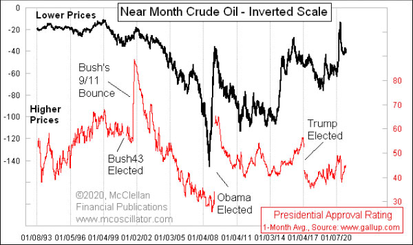
Historically, low oil prices have led the public to say that they like how the president is doing the job. And high oil prices (lower postings in this inverted scaling) have brought low presidential approval. But it has not worked that way during President Trump’s time in office. One could argue that it is working inversely to how it has behaved in the past: 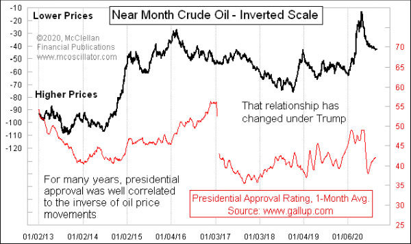
I have used Gallup Poll numbers for this comparison of presidential approval numbers to oil prices because their numbers go back further in time. The downside is that they do not sample that very frequently, doing it just every two weeks lately. Rasmussen samples this daily, and their numbers are consistently higher than Gallup’s for Mr. Trump’s approval. You can make of that what you will. The data which explain Mr. Trump’s approval numbers better than oil prices are the consumer sentiment data. Here is the University of Michigan’s Index of Consumer Sentiment: 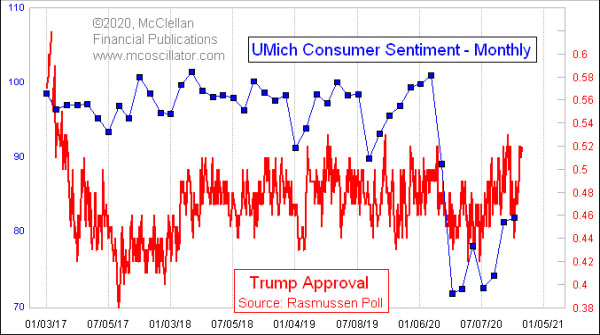
Those data understandably took a big hit with the Covid pandemic and the government imposed lockdowns. They have been bouncing back since then, although not yet to the pre-pandemic levels, and so have Mr. Trump’s approval numbers. Rasmussen’s latest data show 51% approve and 48% disapprove. If those numbers are correct, it is hard to imagine an incumbent president losing. See also this Special Market Reports article in our Learning Center, from 2016: "The Intersection of Stock Market & Political Races". *** Related Charts ### Tom McClellan
Editor, The McClellan Market Report
email: tom@mcoscillator.com
website: www.mcoscillator.com
(253) 581-4889 Subscribe to Tom McClellan's free weekly Chart In Focus email. Copyright ©1996-2020, McClellan Financial Publications. All Rights Reserved. 321gold Ltd

|