Chart In Focus
Yield Curve and Small Caps McClellan Financial Publications, Inc
Posted Sep 24, 2019 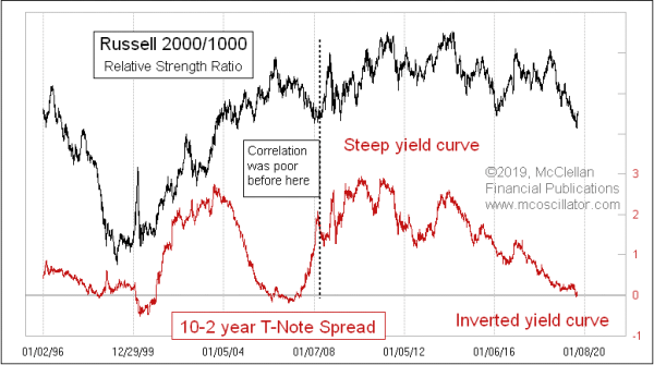
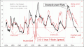
September 19, 2019 Back on August 22, I wrote here about how the spread between the 10-year T-Note yield and the 3-month T-Bill yield gives us a leading indication that is relevant for small cap relative performance. This time, I look at the "yield curve" in a different way, via the spread between 10-year and 2-year yields. The 10-year to 3-month spread is a leading relationship for small cap relative performance, but the 10-2 spread is a coincident one. Sometimes analysts show that as a 2-10 spread, but it works better for this purpose as a 10-2 spread, since it matches up better to what the relative strength ratio is doing. Or at least that has been the case since around 2008. Before then, the correlation was not as good. That is a curious shift point in history; there was a lot going on in the financial markets that year, as most of you remember. The best explanation of the “why” of this relationship as it exists now is that there are a lot of banks now making up the composition of the Russell 2000. The chart below shows data as of earlier this year in terms of the population of the Russell 2000 by S&P sector category. Financial services is number one now at 17.1%, and it has been #1 for several years. It reached as high as a 25.6% weighting in 2015. Banks make their money by borrowing at short-term rates (from depositors, mostly), and lending at long-term rates. So a steep yield curve is the most profitable condition for them. 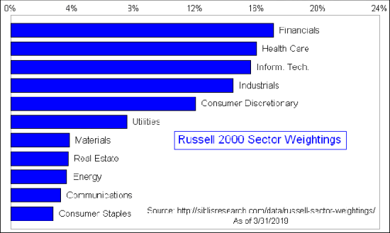
But notice in the top chart above that the relative strength ratio peaks at the same time as the 10-2 spread. So it is really a steepening yield curve that is good for small cap outperformance, not just a steep one. And the flattening of the yield curve since 2014 has meant trouble for small cap stocks as a group. If the Fed can manage to get the yield curve to start steepening again, then small caps could finally turn up and start outperforming again as a group. The FOMC already cut the Fed Funds target rate by a quarter point this week. That cut would need to flow through to the 2-year T-Note yield in order to give small caps a continued relative strength boost. *** Related Charts ### Tom McClellan
Editor, The McClellan Market Report
email: tom@mcoscillator.com
website: www.mcoscillator.com
(253) 581-4889 Subscribe to Tom McClellan's free weekly Chart In Focus email. Copyright ©1996-2019, McClellan Financial Publications. All Rights Reserved. 321gold Ltd

|