Chart In Focus
Rogue Wave Follow Up McClellan Financial Publications, Inc
Posted Jun 17, 2020 
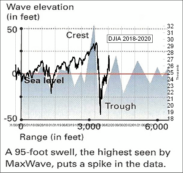
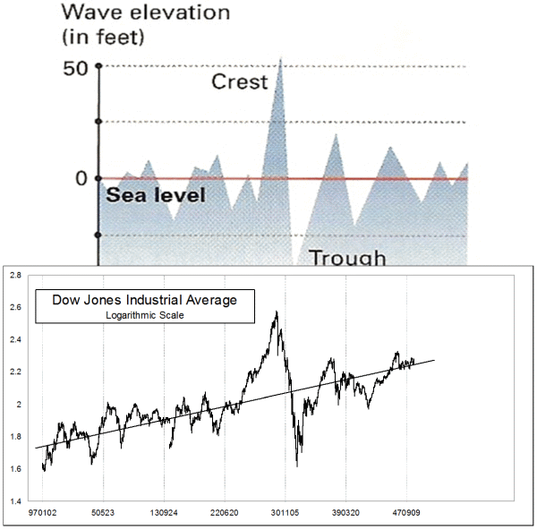
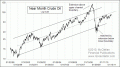
Jun 11, 2020 Back on March 19, I wrote here about "Stock Market Showing Another Example of ‘Rogue Wave’ Behavior". This week’s chart updates that same chart from the article 3 months ago. The only change is that 3 more months’ price data have been added. In an oceanic rogue wave, the huge wave “borrows” energy from the adjacent waves, dwarfing the size of the surrounding chop. One important feature of oceanic rogue waves is that the height of the crest above sea level is matched by the depth of the adjacent trough below sea level, making them all the more deadly for ships. The principle operates in the financial markets as well, although we have to apply an expansive interpretation of what “sea level” means in a price chart. For the article 3 months ago, I added a rough approximation of a regression line drawn through the data leading up to the February 2020 top. The rebound off of the March 23, 2020 bottom has taken price back up above that median line, and now the sharp selloff on June 11 has taken prices back below it again. It appears that the market has returned back to “sea level”, with a lot of help from the Fed running QE4. I also featured in that March 2020 article an overlay comparison of the current chart of the DJIA with an actual plot of an oceanic rogue wave, as captured by a project known as MaxWave. Here is an update of that comparison: (Click on images to enlarge) 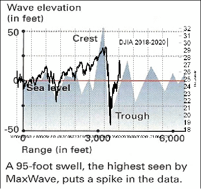 The alignment of the price structures leading up to the February 2020 top was not perfect, and the alignment of structures following the bottom has also not been perfect. But the similarities nevertheless do exist. I had first made a comparison of prices to that MaxWave pattern years ago, after noticing the similarity of its pattern to the 1929 top and 1932 bottom. A little bit of chart magic and stretching got the chart structures aligned in this comparison: 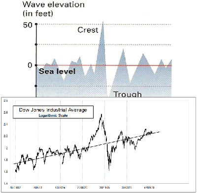 Sea level for the stock market in this case is an upward sloped line on this logarithmic scaled chart. It is not perfect, but it works well enough. The point about oceanic rogue waves is that eventually they pass, and the chop returns to normal size. That same point operates in financial market rogue waves. The difference is that in the ocean, the “sea level” remains mostly constant. In the financial market rogue waves, any assignment of a momentary sea level has to be viewed as temporary. Once the price returns to it after the rogue wave, some new trend can develop with some new definition of “sea level” for prices to oscillate above and below. *** Related Charts ### Tom McClellan
Editor, The McClellan Market Report
email: tom@mcoscillator.com
website: www.mcoscillator.com
(253) 581-4889 Subscribe to Tom McClellan's free weekly Chart In Focus email. Copyright ©1996-2020, McClellan Financial Publications. All Rights Reserved. 321gold Ltd

|