Chart In Focus
Finally, An Actual Use For Bitcoin McClellan Financial Publications, Inc
Posted Jan 27, 2018 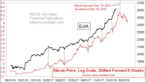
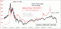
January 25, 2018 Bitcoin and the other cryptocurrencies have captured the hearts of millennial speculators around the world. Their grandfathers may have traded gold during the run-up to gold’s big blowoff top in 1980, and their parents may have traded Internet stocks in the late 1990s, but the young hipsters want to play a more modern bubble for their “It’s different this time” denial. Bitcoin was designed as an online medium of exchange, so that customers could use it to pay vendors for goods and services. Its primary use lately has turned into being a speculative trading vehicle. But lengthy transaction times and high fees are starting to take the bloom off of Bitcoin’s rose as a transaction medium, and the price is showing that diminishment of interest. And as this week’s chart shows, Bitcoin’s price plot also shows us something else: a leading indication of what the DJIA is going to do a couple of months later. In this chart, I have shifted the price plot of Bitcoin forward by 8 weeks (56 calendar days) to reveal how the DJIA is following in Bitcoin’s footsteps. This chart goes all the way back to the autumn of 2016, when Bitcoin was still trading around $600. The leading indication effect really did not start showing up until around February 2017, when the price was closing in on $1000. That seems to be when the big speculation frenzy in Bitcoin started, and thus when it began modeling the same sort of waxing and waning of interest people have in the stock market. Usually when analysts do price pattern analogs, we employ a prior period from the same market index’s history, such as comparing the current SP500 price plot to that of 4 years ago. For example, see The Unexplainable 4-Year Rerun. But there is precedent for using another market’s price behavior to model prices in a different market, especially during a bubble. The dynamics of how human emotions react to a speculative bubble remains largely the same from one bubble to the next, since our brains do not change. Years ago in our McClellan Market Report newsletter, we showed this next chart, illustrating how the 2007-08 commodities bubble strongly resembled the Internet Bubble of 1999-2000. 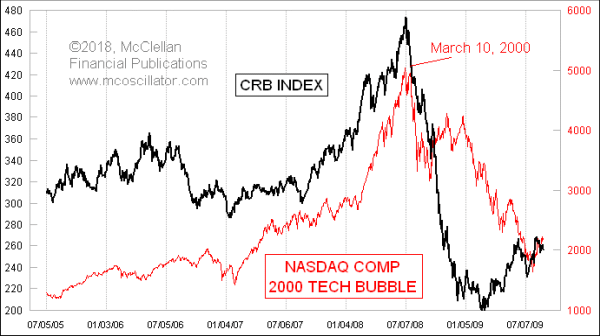
Throughout the CRB Index’s advance in 2007-08, it closely matched the dance steps seen in the Nasdaq Comp during 1999-2000. And as the CRB Index’s collapse started, it also matched the Nasdaq’s path downward. Eventually that pattern correlation broke up, as happens with all pattern analogs eventually. The point is that the dynamics of humans’ reactions to price bubbles remain the same from one bubble to the next, and that shows up in the resemblance between the price patterns. So here in 2018, we have a collapsing Bitcoin bubble, but a still-intact stock market bubble, as evidenced by high valuations, the lack of meaningful drawdowns (dip-buying), and a nearly parabolic price plot. The DJIA’s movements are matching those of Bitcoin 8 weeks prior. Why 8 weeks? That’s a fun question, but not an essential one to answer for us to be able to observe and digest this behavior. My eurodollar COT model says that a major price top for the U.S. stock market is ideally due in early March, as discussed in our latest McClellan Market Report newsletter. But Bitcoin’s chart implies that the corresponding top is due a bit earlier, in February. The real answer may lie somewhere between the two. *** Related Charts Jun 08, 2017
The Unexplainable
4-Year Rerun | Dec 12, 2013
Review of Analogs
| Jan 26, 2017
Bitcoin is a Bubble
We’ve Seen Before | ### Jan 25, 2018
Tom McClellan
Editor, The McClellan Market Report
email: tom@mcoscillator.com
website: www.mcoscillator.com
(253) 581-4889 Subscribe to Tom McClellan's free weekly Chart In Focus email. Copyright ©1996-2018, McClellan Financial Publications. All Rights Reserved. 321gold Ltd

| 