|
|||
The Ugly Reality of the US StockmarketClive Maund It doesn't take a great treatise or any "rocket science" to expose the ugly and sordid reality of the true condition of the broad US stockmarket - all it takes is a few charts and a modest helping of common sense. 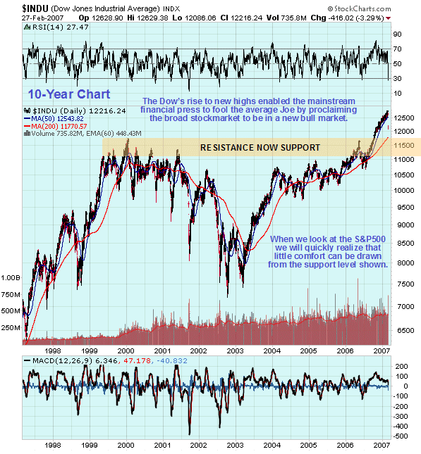 The reason why the Dow Jones Industrials Average features so prominently in the mainstream financial press is that it is the principal tool used by wholesale vendors of stock to sucker the ordinary retail investor into buying at market tops. The recent past provides a perfect example. On our 10-year chart for the DJIA we can see how it broke to new highs last year, an event that was accompanied by great fanfare in the media, who have since been trumpeting the glorious achievements of the "bull market" ever since. The problem is that the Dow Jones Industrials is not a true representation of the state of the market as a whole, being made up as it is of a narrow basket of very high cap stocks. 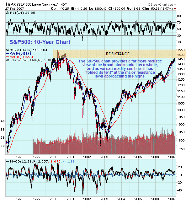 The real stock market is shown much more accurately and faithfully by the relatively neglected S&P500 index, the chart for which tells a very different story. On its 10-year chart we can see that it has definitely not broken out to new highs, and is instead buckling beneath the heavy resistance approaching its 2000 highs, with which it is danger of forming a Double Top. Investors in the US stockmarkets who nevertheless remain impressed with the gains of the past 4 years, during which time this index has risen from about 800 to 1400 would find it educational and rather sobering to try spending those gains in other countries. 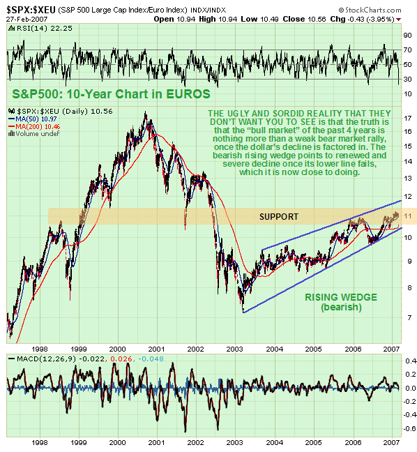 If you factor in the decline of the dollar over the past 4 years, the gains during this period look nowhere near as impressive. This can easily be done by plotting the S&P500 against say the Euro or the Swiss Franc. The 10-year chart of the S&P500 chart plotted against the Euro shown here exposes the ugly and sordid reality that the so-called bull market of the past 4 years is nothing more than an anemic bear market rally, that has taken the form of a bearish Rising Wedge - and some mighty unpleasant stuff is likely to hit the fan once it breaks down from this pattern, which it is now close to doing. Not that the writer wishes to "rain on your parade", just call a spade a spade. You owe it to yourself and those around you to face reality as it really is, and not as some would like you to believe. We will be looking at the implications of a continuing fall in the broad market for the Precious Metals sector on www.clivemaund.com in the near future. Feb 28, 2007 Clive Maund
is an English technical analyst, holding a diploma from the Society
of Technical Analysts, Cambridge, England. He lives in Chile. Copyright ©2003-2011 CliveMaund. All Rights Reserved. Charts courtesy of StockCharts.com. 321gold |
