|
|||
Charting GoldHoward S. Katz Each commodity and each economic good has its own characteristics, and before you trade any market seriously, you should stick your toe in the water, so to speak, (meaning to trade at a level you can afford). In this way, you can acquire knowledge of the characteristics of the particular market. (Click on images to enlarge)
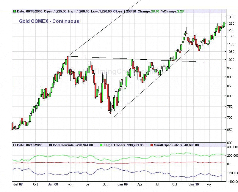
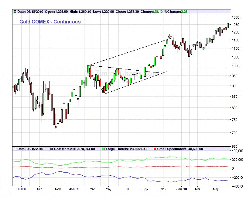
I do not recommend paper trading because any market has a way of grabbing hold of your emotions and making you do things which you would not do under the perfect conditions of an academic study (where there is no money at stake and no time pressure). Most people in the markets are acting on their emotions, and if you want to take their money, then you must be in control of yours. And the best way to learn to do that is to trade with your own money (but always an amount you can afford to lose). Indeed, this experience in controlling your own emotions is so important that it applies to those around you (who are supposed to be on your side). Very often a giant emotion will dominate a market. This emotion becomes so strong and so universal that it is very hard to take a position against it. But when I had gotten to the point where I had mastered this, I found that there was another trap. I kept running into a series of mistakes on the part of the people around me because they had succumbed to the prevailing emotion and were not properly executing my orders. Of the various technical theories on the markets, my criteria for deciding which ones to use is based on what works. And I have found the best results with the chart patterns described in Technical Analysis of Stock Trends by Edwards and Magee. These are simple, geometric patterns with forecasting implications. When one of them appears, it is usually reliable but not perfectly. (Edwards and Magee say they work 70% of the time.) For this reason, I try to increase my probability of success by finding 2 corresponding patterns in goods known to move together. For example, consider the ascending triangle which formed in gold from March ’08 to October ’09 and broke out thereafter. Let us give this a 70% chance of hitting its price objective line (which is the line drawn parallel to the bottom line of the triangle and going through the upper left hand point). The price objective line is rising very rapidly. If gold hits it next spring, it will be at $3,300. If it hits it in spring 2012, then the price will be between $4,500 and $5,000. Since this number is very high, it has the quality of too-good-to-be-believed. However, we are now getting another ascending triangle in the HUI. The only difference is that the triangle in gold broke out last October while the triangle in the HUI looks ready to break out in a matter of weeks. If it does, then we can compound probabilities as follows. The probability of failure in gold is 30%. The probability of failure in the HUI will also be 30%. It is like the math problem of flipping a coin twice and asking what is the chance that you will lose both times. Our chance of losing both times in the markets is (1 - .70) x (1 - .70) = .30 x .30 = .09. Thus our chances of being wrong are only 9% instead of 30%. If we can find another good chart pattern in a related good (say, silver), we could multiply our probability even more. If silver breaks out of a corresponding triangle, then we have .30 x .30 x .30 = 2.7%. That is, our chances of being wrong will be less than 3%. And those are good odds to play. All bullish chart formations must be confirmed by increased volume on the breakout. Bearish formations do not need volume confirmation. (Stocks need volume to rise, but they fall of their own weight.) Almost all chart patterns have price objectives attached to them. This tells you how far, at a minimum, the economic good will travel before reversing. For a triangle, the price objective is not a point (as it is in most cases) but a line. Before the chart reverses, it will reach the price objective line. This means that the slower the chart moves the higher it will go. Below we have a symmetrical triangle which formed over the middle part of 2009 and broke out in September. Notice how gold reached the price objective line of this triangle in November, and this was an important clue for my call of an intermediate reaction in gold in early December. A price objective or price objective line is always a minimum. This means that the good has to at least reach this point. When it does, there is usually an intermediate (or short term) reaction. And then the good may continue up to a higher level.
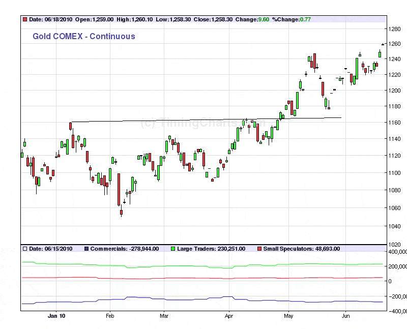
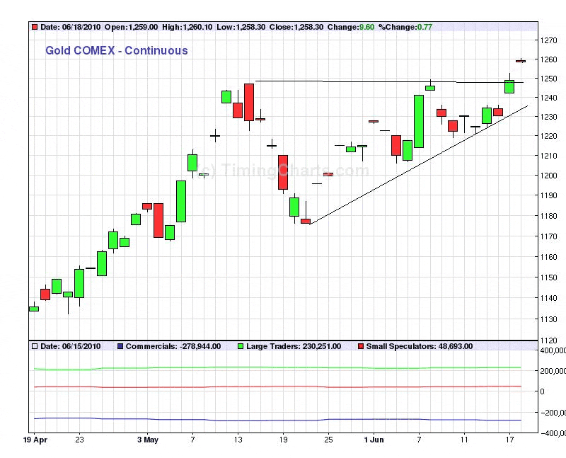
Above we have a head and shoulders bottom in gold extending from December ’09 to late April ’10. Its name comes from its shape, which is that of a man’s head and shoulders turned upside down. (There is also a head and shoulders top, which is rightside up). The line joining the two high points is the neckline, and the formation is complete when prices break above the neckline (a little above $1,160, in late April). Notice that the $80 price break in gold of mid-May was a very nice return to this neckline (which has now become support). To get the price objective on a head and shoulders bottom, we measure the distance from the bottom of the head to the neckline (on a semi-log chart). The distance from the bottom of the head to the neckline is 10%. Projecting a 10% rise from $1,162. We then measure upward from the neckline at the point where the price action crosses above it (also $1,162). This gives us an objective of $1,281. If we use the electronic gold chart, which records trading overnight, the calculation is close to $1,300. So this objective has not yet been reached. Gold is a good chart commodity. It forms chart patterns frequently, and they are reliable. I mean to show by this study that good technical analysis is not too difficult for the average person. Quality (recognizing the patterns and applying them correctly) is more important than quantity (knowing a large number of patters) for the reason that a few, simple patterns tend to repeat. You must take some risks in trading, but if you stick out your neck too far, you will eventually get it chopped off. So limit possible (worst case) losses to 3-6 months of income or 20% of capital. As a teaser, I will leave you with a final chart pattern, which completed on Friday. Try to identify it and see if you can calculate its price objective. (Hint, you will need to print out the computer image on paper and complete work with pencil and ruler.)
### Jun 21, 2010 Howard S. Katz holds a BA in mathematics from Harvard University. He became interested in Austrian economics and started a successful investment newsletter, The Speculator which focused on gold and gold stocks. He is a lifelong advocate of gold and gold stock investing. Later, he published The Gunslinger for investors interested in gold and gold stocks. In addition, Mr. Katz authored three books on gold, the gold standard and money in politics: "The Paper Aristocracy", "The Warmongers" and the soon to be published "Wolf in Sheep's Clothing". He was involved in the Objectivist movement in New York in the 1960s and was an early member of New York's Free Libertarian Party. Mr. Katz is a contributing author to The Ludwig von Mises Institute where his writings appear along with those of contemporaries Llewellyn H. Rockwell, Jr., Murry Rothbard and Robert Murphy, among others. He has been interviewed on numerous radio programs. He is currently Chief Investment Officer, editor and publisher of the gold and gold stock investment newsletter, The One-handed Economist.
321gold Ltd |