|
|||
Poor Man's Gold!David Chapman
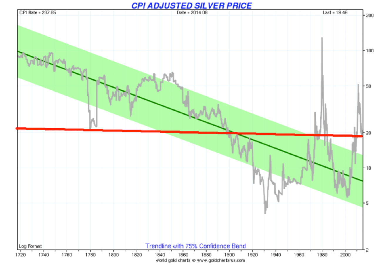
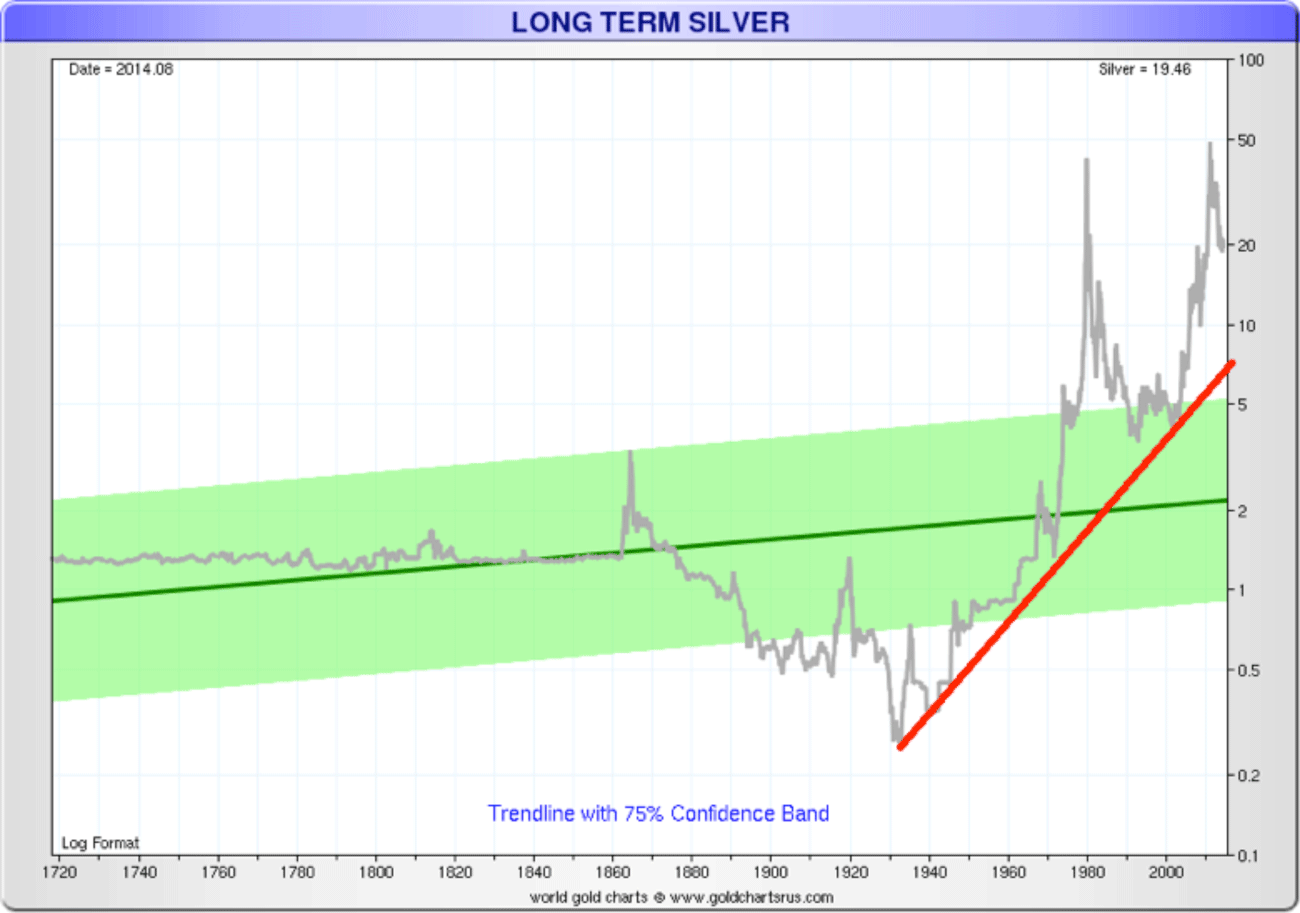
Source: www.sharelynx.com Silver is the Rodney Dangerfield of the precious metals. It gets no respect. Maybe this chart says why. The price noted in the chart above is as of the end of August. Today it is lower around $17.80. On an inflation-adjusted basis, silver is trading around where it was in either the late 1800’s or “heavens above” back around 1780. Some improvement. Outside of a good run in the mid-1800’s and the famous Hunt Brothers spike into 1980 silver has actually been in a long-term downtrend on an inflation-adjusted basis. Silver has thrust above the long-term downtrend channel so that is positive. It remains down roughly 65% from the high of 2011. As to the inflation adjusted 1980 high, well silver would have to reach to roughly $128 to equal that run. Let’s look at the same chart without the inflation-adjustment. It is a very different picture. Silver prices for the longest time were relatively fixed at around $1.30. There was a spike during the civil war that took silver prices into the $3 territory. But it didn’t last long and silver prices began a long decline that didn’t bottom until 1932 around $0.25. The bulk of the decline occurred from 1865 to about 1912 that covered the period known as the “Long Depression”. It also included the period known as the “Gilded Age”. The “Gilded Age” was a period where railway barons and tycoons dominated (the 1%) the economy. During that period, skilled workers did relatively well but the majority of the population, many of who were immigrants lived in poverty and their children toiled in the factories.
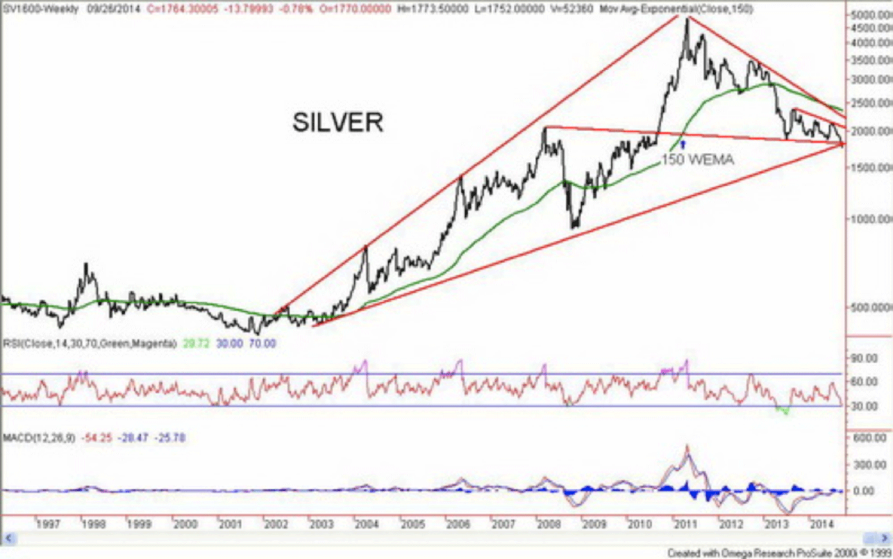
Source: www.sharelynx.com Based on this very long-term chart above silver would appear to have solid support down to around $8. A collapse to that level would not sit well with silver bulls. Silver does not look particularly well on the weekly chart. It appears to be breaking down. Silver recently broke down under its low of June 2013. That has negative implications, as the weekly chart below would appear to attest.
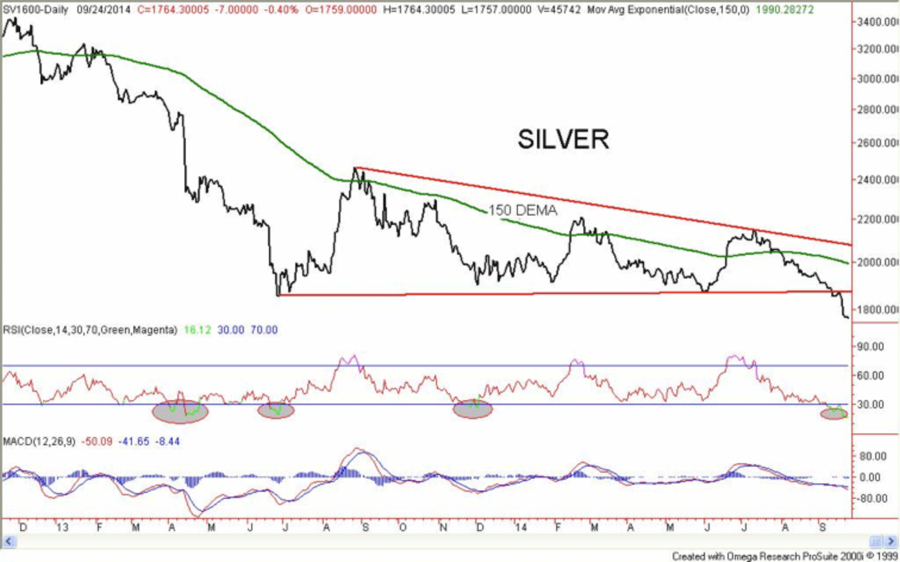
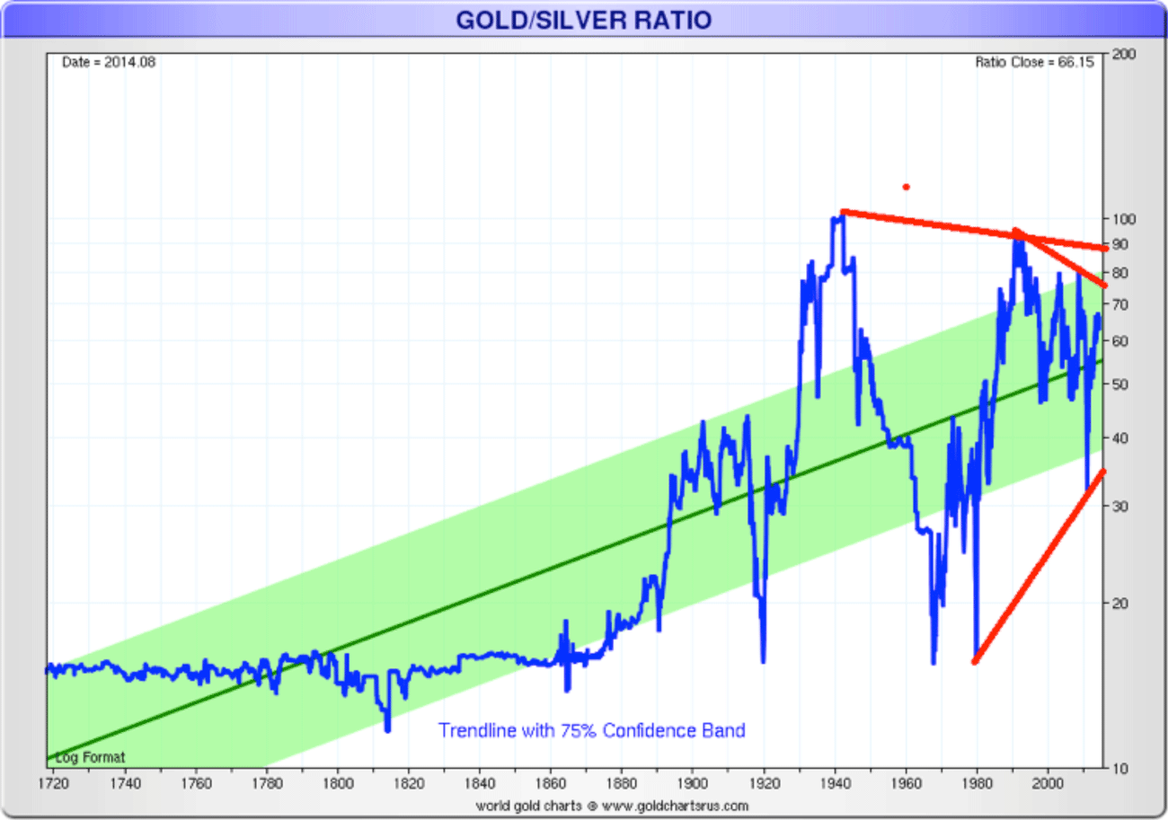
Charts created using Omega TradeStation 2000i. Silver is either at a huge support zone or it is poised to break down further. Argumentatively silver could be breaking down from a descending triangle pattern with potential measuring implications to $11.50. This is not to say it will occur. While the weekly MACD indicator is rolling over it is well above the lows of June 2013. The RSI indicator is also higher and is moving into oversold territory. Positive divergences are present in the indicators. The daily chart presents another picture. The silver RSI has moved into deep oversold territory. On previous occasions at minimum, a rebound rally got underway. Once a rebound rally gets underway, it becomes important to see how well it does. If it is a test of the breakdown of the possible descendent triangle it should fail around $18.75 and at worst be contained under $20. A breakout over $20 would be more positive and could suggest that a stronger move is underway. The final chart is a long-term one of the gold/silver ratio. Throughout the 19th century, the gold/silver ratio held steady around 16. Many gold bugs often refer to this century old ratio as potential zone for the gold/silver to return to. Given it has been over a century since that ratio was seen it is probably unlikely and it may be relic of the past. However, it is interesting to note that when the US was established the US Secretary of the Treasury Alexander Hamilton set the ratio at 15 ounces of silver to one ounce of gold or 15:1. That ratio had also existed elsewhere in Europe since the 1500’s. It said that in nature the ratio is around 9:1. With a current value of around 68:1 it does seem high and appears to be approaching long-term resistance near 75:1. Over the past century, the ratio has ranged widely from 10:1 to 100:1.
Charts created using Omega TradeStation 2000i.
Source: www.sharelynx.com Silver is known as “poor man’s gold”. Numerous indicators suggest that silver is considerably oversold at current levels. Silver sentiment is at levels seen at other major bottoms. The gold silver ratio is at or approaching levels where the ratio has reversed before. Silver normally outperforms on the upside and underperforms on the downside. The current drop in silver prices is typical of silver falling faster in a bear market. Finally, silver is making new lows while gold has not. A possible positive divergence, but only as long as gold does not make new lows itself. Despite the deep oversold conditions silver remains vulnerable to the downside given the potentially bearish breakdown. The key going forward is the nature of the rebound. A strong one that regains $20 and moves higher could suggest that the final bottom is in. A failure below $19 might signal that new lows lie ahead. Silver can’t get any respect. ### Sep 25, 2014 David Chapman: Disclosure Copyright 2014 All rights reserved David Chapman 321gold Ltd |