|
||||||||||||||||||||||||||||||
Technical AnomalyBrian Bloom [Barb's note
for readers in a hurry, you can jump to Brian's gold section
by clicking
here.] The reason I honed in on these charts flows from the discussion regarding Bear Stearns that has emerged over the past week - regarding their packaging of Mortgage Backed Securities and Collateralised Debt Obligations. A discussion on this phenomenon can be found at http://www.321gold.com/editorials/tustain/tustain062307.html. What caused me to prick up my ears was the fact that Hedge Funds are heavily involved in this dubious market place; and they are also involved in the derivatives market. Behind the derivatives market stands JP Morgan. My understanding is that this organization stands behind up to 80% of all the world's derivatives contracts. By itself, this should present no problem if JPM's book is balanced between Bull and Bear obligations. However, if some counterparties fall over, this could have a cascading effect which could negate the apparent safety of the balanced book. Trillions of dollars of "potential" obligations are involved. In simple terms, the evolution of the sophisticated derivatives markets has facilitated an ability of the larger players to play financial games in the world's markets, and one of those games is exposed below. The flip side of such game playing is that if the health of the derivatives market starts to deteriorate, this will have a magnifying impact on markets across the board. That is why the health of JPM, specifically, is so important. The first chart below is a weekly chart going back ten years. The second is a daily chart - also going back 10 years. Before we look at what these charts are telling us, it will be instructive to understand how an On-Balance-Volume chart is constructed. Armed with this understanding the reader will appreciate the issue which came to my attention. Essentially, the logic behind OBV is that price movements by themselves are not as important as buying and selling "pressure". If a share rises 10 cents on one hundred shares and then falls 6 cents on one thousand shares, there has been net selling pressure - even thought the price lands up a net 4 cents higher. Daily OBV charts are constructed by taking the volume traded for the day and assigning a positive or a negative value to this volume depending on whether the price closed up or down at the end of the day relative to the end of the previous day. By contrast, a weekly chart
of the OBV assumes that the entire week's volume was buying pressure
if the price ended higher relative to last week; and selling
pressure if it ended lower. If (say) 1,000 shares a day change hands over a period of four days (Monday through Thursday) and on each day the price falls by one cent, then each successive day's volume is treated as selling pressure. Then, if the price rises 5 cents on Friday, on (say) 1000 shares, the 1000 share volume is regarded as buying pressure for that day. However, if you are plotting the same OBV chart on the weekly charts, you would argue that 5,000 shares changed hands between Monday and Friday, and the price ended up one cent on the week - Therefore the entire week's volume was buying pressure. Let's now look at the weekly chart of JPM 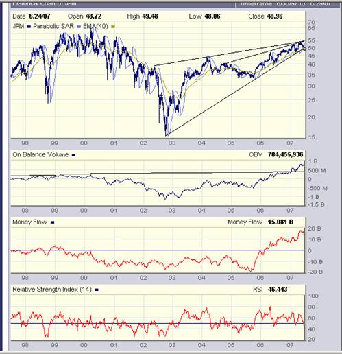 Note the black trendline drawn in on the OBV chart and how this chart gave a "Buy" signal in early 2007. Now look at the daily chart below. 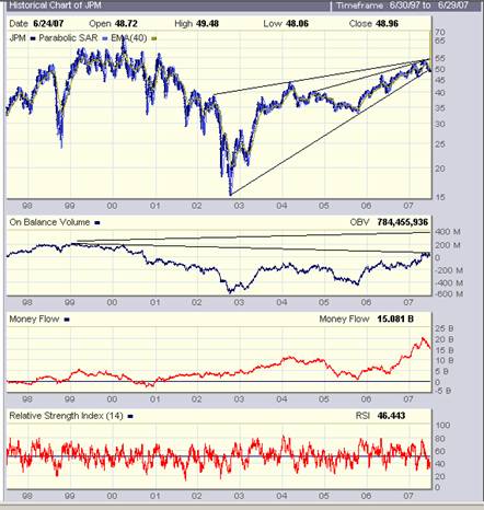 Note how the second trend line that has been drawn in is pointing downwards, and how the OBV chart appears to be bouncing against that trendline. If it breaks up, this will be bullish. However, if it fails to break up it will be extremely bearish, for the following reasons:
Right now, there is enormous confusion in the overall market place regarding the direction of the Primary Trend of Industrial Equities. Thos who follow the Dow Jones Indices have convinced themselves that the Primary Trend is "up" because the Down Jones 30 Industrial Index has broken to new highs - as confirmed by the break to new highs of the DJ Transport Index. Unfortunately, this "confirmation" is not as trustworthy as it once was. Those of us who understand the dynamics of business at its coal face will understand that the Transport companies may be making super profits for no other reason that they are passing on to the consumer the percentage increase in the oil price. Not to put too fine a point on it, they are making higher profits because they are gouging their customers and not necessarily because business (as measured in volume) is good. Here is an example of what I am talking about. The following numbers reflect Exxon's profits over the past three years (Billions of dollars):
Assuming a mark-up of 75%, what this implies on a per barrel basis is:
To maintain its dollar profits, Exxon should have raised prices from $52.50 by $20 to $72.50 Under the above scenario, Exxon would pocket an "unearned premium" of $15 a barrel So, in simplistic terms, that's one possible reason why the Transport Index as a whole rose to its new high - as can be seen from the following charts - courtesy Decisionpoint.com 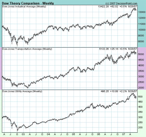 A potential reason why the Dow Jones Industrials rose to a new high flows from the possibility that it has been deliberately ramped - i.e. It may have been deliberately pushed to a new high. I am not intimately familiar with the construction of this index but it is my understanding that some shares are weighted more heavily than others. By ramping those particular shares the entire index could be 'managed'. By contrast to this apparent bullishness, those who remain in the camp that is arguing that the Primary Trend is still down, are focussing on the $SPX chart below - which has not risen to a new high. 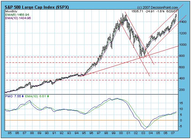 Those who are familiar with technical patterns on the charts will recognise the possibility that there is a "double top" formation in the making, and a failure to rise to a new high will be bearish because a) It will represent a technical non-confirmation of what the DJIA has achieved, and b) A Double Top formation is inherently bearish. Failure to penetrate to a new high implies that the Primary Bear Market that was previously in place is about to resume. This brings us back to the JP Morgan Chart. (Let's focus on the daily chart) Note how its price has also failed to reach a new high relative to its 2000 peak. However, in context of the possibility that the rising wedge is rising within a Primary Bear Market, under those circumstances the breakout will almost certainly be to the downside. If the price breaks down from the wedge, on rising volume, then the OBV chart will pull back sharply from its falling trendline. Worryingly, JPM is not just any old company. It is "the" bank which stands behind the Derivatives Industry - which, in turn, has formed the foundation on which the most recent boom in share prices has been built. The compound growth rate of industrial share prices over the past decade or two has been extraordinary relative to historical performance. This has not occurred because underlying business conditions have been naturally healthy. It has occurred because the economy has been on steroids. The Federal Reserve Bank has loosened its grip on the money supply, and the Derivatives Industry has provided an afterburner by allowing debt to be leveraged yet further. As a man who, during the 1980s, was heavily involved in the Leverage Buyout Industry, I understand in my bones that leverage is a two edged sword. Fortunately I was not personally affected, but I was involved in an industry where mega dollar profits were being made on the upside, and wipe-outs occurred on the downside. Leverage is not a sensible concept if used for the wrong reasons. The use of excessive leverage is just plain stupid. Gold It because of the enormous risks associated with the above scenario that the gold price is so important to watch. In some circles, the gold price is a litmus test for the health of the underlying economy. (I have expressed my personal doubts regarding the logic of this in previous articles. However, it would be foolish to ignore the fact that many people do believe this to be true). So let's look at the gold price. I have chosen the chart below using a 3% X 4 box reversal Point and Figure Chart, but this time using a semi log scale for price. (Courtesy stockcharts.com) 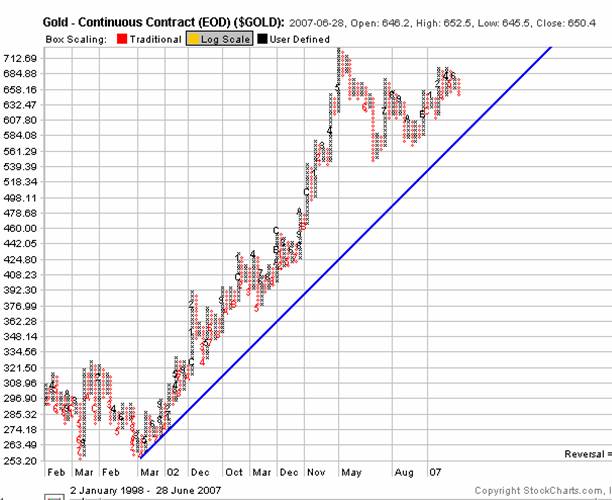 The reason I chose this particular scale is that it ignores all short term trading static and clearly demonstrates that - at any price above $625 an ounce - the Primary Trend of Gold is "up". Unlike the Industrial Equities markets, there is no room for debate on this. Arguably, we can begin to become seriously concerned about the primary Trend of Gold if its price falls below $584 an ounce. As we approach the end of the week ended June 30th (Financial Year End in some countries) we may find some book squaring[Barb's comment: You've hit the nail right on the head here, Brian. So few followers of the markets address this issue. And it's "Triple Slizzardsville" at the end of this quarter, what with the full moon (and it's a blue moon month in some parts of the world)... the goofy holiday schedule for next week... added to the "book squaring" as you so politely call it. Some canny folk might refer to the latter as "book cooking."] However, next week will be an extremely important week. If the Central Banks are going to impose their wills on world markets, next week is the week in which this is likely to happen. If markets rise strongly next week this will (in my view) represent yet further evidence that the Central Banks are engaging in active intervention. We will have to wait and see. Jun 28, 2007
Beyond Neanderthal Via the medium of its light hearted storyline, it examines how the world has gotten itself into the horrific quagmire of economic and social problems with which we are now faced - and puts forward one possible course of action on which we might embark to dig ourselves out. It may be ordered over the internet via www.beyondneanderthal.com. Or purchased from Amazon. 321gold Ltd |