>
|
|||
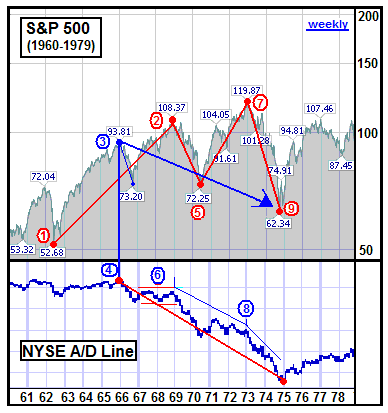
The Advance that Brought DeclineDavid Chuhran I look for quality everywhere, especially in the stock market. Not only am I searching for quality stocks worthy of investment, but I'm also searching for quality indicators to use as tools in all forms of my technical analysis. I must admit that I don't use them all. I've found that I could over analyze to the point where several indicators would remain in constant conflict leaving me frozen in a state of analysis paralysis. As time passes and my experience with the different levels of reliability for each indicator has increased, I've been able to narrow my arsenal to those indicators that work for me. When I was growing up my father was constantly working on his technical charts. He had his ruler and his pencil, and would sit there with us in the family room drawing meaningless lines (to a kid) for hours. I certainly wouldn't have had that kind of patience, call me computer spoiled, but after his charts were properly updated then out came the ledgers. I remember he told me the ledgers had 4 active pages with 10 columns per page with each containing a different calculation that he'd track simultaneously by hand. After the computations were complete, out came more charts for their pencil drawn updates. He loved it and I resigned myself to being poor! I figured as an adult it was highly unlikely I'd expend the colossal effort required to complete all the tasks which appeared so necessary to successful investing. Computers changed everything! What seemed ominous at that time became profoundly easier as computer derived computations made those tedious, time consuming, hand made formulations available to everyone with the click of a mouse. So many indicators are available now that the hard work lies not in the actual computations and chart plotting as before, but rather in the years one must spend narrowing their technical toolbox down to a manageable level of reliable tools. Nevertheless, the only one that I remembered from childhood turned out to be one of the earliest and most reliable indicators---the Advance/Decline Line. The advance/decline concept was simple, the math was understandable (even for a kid), and the visual interpretation appeared reasonably obvious. The Advance/Decline (A/D) Line is one of the most widely used indicators which measures the momentum of an advancing or declining market. The math is easy because it's simply the number of advancing issues compared to the number of declining issues. If the advancers outnumber the decliners, then that total is added to the previous cumulative total. If the decliners outnumber advancers, then the difference is subtracted from the previous cumulative total. The A/D Line is widely known and accepted as a reliable leading indicator of an impending major market move. In most cases the lead time would run 3-6 months ahead of the break allowing time for confirmation by comparing it to another important indicator, the cumulative net A/D Volume. It is very important to always confirm with volume! The A/D Line serves as an early indicator for signaling a reversal in both Bull and Bear markets and has been reliable throughout history. Until now! Since the A/D Line is a measure of market momentum, we must first discuss what constitutes an advance or decline. Prior to January of 2001, when we still traded in eighths of a point, it took a 12.5 cent move to generate an advance/decline. Today, all it takes is a penny! Only one tiny, slim copper penny minted with "Honest Abe's" face is all it takes. That's it! What kind of momentum is that? To be honest, I really don't even know why we still have the penny, no offense to President Lincoln, because it probably costs a dime to make one. I tell cashiers, "No pennies, please!" because the ashtray in my car is overflowing. So, what does this mean for our venerable A/D Line? I went back and searched my archives and this is the first (old) chart I ran across. I was looking for an historical illustration of prior A/D Line performance. At the time, the 1973-74 Bear market was the worst market performance since the Crash of 1929. The lead-in to that Bear market provides graphic visual testimony to the value of the A/D Line.
In July, 1962 the S&P hit a low of 52.68 (1) where it began a 100%+ climb to high of 108.37 in December, 1968 (2). This Bull market was only interrupted by a ~20% correction in 1966 (3), but notice the corresponding A/D Line trend change in early 1966 (4). From the 1968 top (2), the index fell to 72.25 in May, 1970 (5) for a 35% Bear market drop! The A/D Line was relatively flat (6) during the run-up to the 1968 top (2), but turned sharply downward in early 1969 signaling potential trouble ahead (6). What was the S&P doing? The S&P rebounded from its May, 1970 Bear market low (5) by climbing just slightly less than 70% to a new high of 119.87 in January,1973 (7). This entire climb was accomplished in divergent opposition to the A/D Line that had been sending signals as early as 1966 (4). In addition, overwhelming A/D Line evidence showed up in 1969 (6) along with further confirmation coming in 1973 (8). The market went into crash mode and fell to 62.34 (9) for a 44% Bear market fall! The 1973-74 Bear market was considered the worst blood bath since the Crash of 1929; and the A/D Line correctly signaled the weakness in advance. The next archived chart I found was a little more recent, but still historical. I really didn't care that the chart was from May 2002. I was in search of a little more recent history and I saw what I was looking for right away.
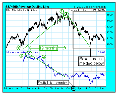
First, notice that the S&P 500 was in a solid uptrend beginning in October 1998 (1). About three months later, the A/D Line began a reversal (2) followed by 6 months of sideways movement before it resumed the downtrend in July of 1999 (3). The initial A/D Line reversal occurred ~19 months before the S&P 500 began its hard drop to its recent low (4). The A/D Line clearly signaled the impending future market reversal leaving the finer specifics such as when, how high/low, and how long to other technical indicators. The A/D Line was one of the great, quality leading indicators amongst many average, and often conflicting indicators. What happened after the 2001 change to pennies?
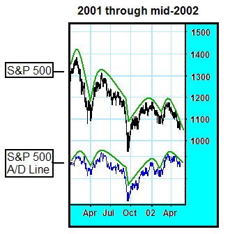
I melded the S&P 500 into its A/D Line (post 2001) to better see their interrelationship. I came to the conclusion that they're very much related; as a matter of fact, they're now the same! Since all it takes is a penny, the A/D Line is a mirror image of the Index. I needed broad and recent confirmation, so I went next to a current NYSE chart.
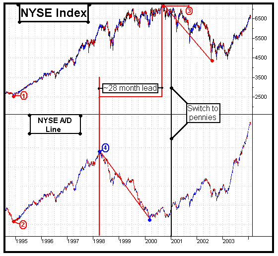
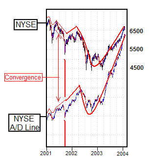
The first thing I noticed was the trend pivots in 1995 (1 and 2). The NYSE trend remained intact from that pivot, with a few corrections along the way, until reaching its top in mid-2000 (3). Notice the A/D Line trend reversal in March of 1998 (4) signaling the momentum change and future market turn ~28 months prior to the market top. Like the S&P charts above, the NYSE A/D Line did its job by throwing the market's cards face up for all to see. Sure, there was more money to be made, but this was an early signal that should've alerted everyone to begin looking over their shoulder. So, what about the change to pennies?
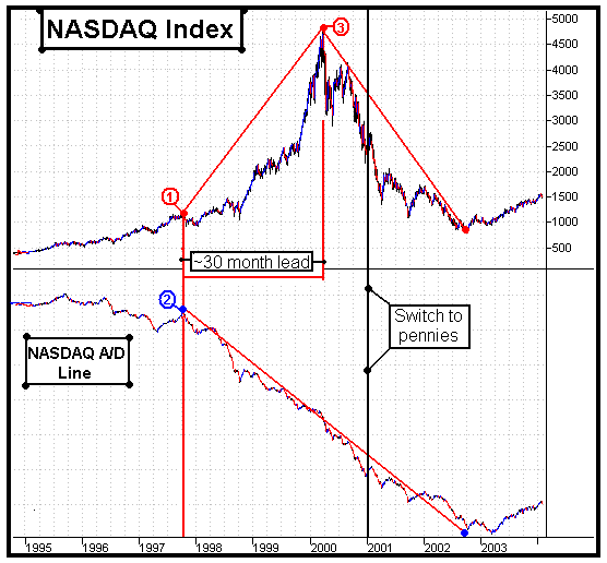
The Index and the A/D line began this period established in opposite trends and there was certainly some convergence for the first 9 months. The NYSE fell from the 6500 range down to around 4500 during a ~12 to 15 month period where advances were exceeding declines. This represents a 30% drop in the NYSE while we were experiencing a majority advance. The A/D Line crossed the 2001 change to pennies with an upward trend and corresponding momentum that took 9 months to wash out. Somewhere around September of 2001 the A/D Line began to mirror the Index. This is clearly indicated above as each and every move became more synchronous as time went on and a penny advance or decline moved the A/D Line the same amount as the Index. They became one! Furthermore, the rising A/D Line from 2001 through mid-2002 was not signaling the 2003 run up in the NYSE. Instead, it was following along through the second half of that period while the Index carried it higher further accentuating its uptrend. From the mid-2002 dip on, it's strictly a mirror even as it's presently in the process of eclipsing new highs. Let me say that again, " ...eclipsing new highs." This indicator has a very long history. When has the A/D Line ever reached new highs before the Index itself? Never! Our reliable indicator has failed us! It's also important to note that the same "penny" moves the cumulative net A/D Volume as well skewing its results and rendering it useless as a confirmation tool. Lastly, I went to the NASDAQ for final confirmation as it had the most pronounced run-up and the most precipitous drop.
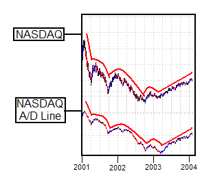
As the early mania began in late 1997 (1) the A/D line (2) was signaling it was already over. This tells me that the NASDAQ run-up was very narrow and highly concentrated. Regardless, the momentum shift was clearly signaled by an uninterrupted and steady decline in the A/D Line ~30 months prior to the NASDAQ top (3) and subsequent drop. The NASDAQ reached a closing high of 5048.62 on 3/10/00 (intra-day 5132.52) followed by a steep drop to a low of 1119.40 in 2002. That was a breathtaking 78% drop! Regardless, if you happened to sell based on only the A/D Line reversal signal in any of these charts above, you would've had more money and more sleep than if you sold in a panic years later at the bottom. I'm not recommending this; I'm only making the point to highlight the past reliability of the A/D Line. I looked at the post 2001 switch to pennies and found the same thing. The NASDAQ A/D Line followed along in synchronous harmony (as shown below), no longer offering any clues to the future momentum of the market.
So, what does this mean for our stalwart market breadth indicator, the Advance/Decline Line? It's worthless! Unless we can restore the calculations that genuinely reflect momentum, like moves of a dime or more preferably a quarter, then the A/D Line is a meaningless mirror image of the market index. In my opinion, it has lost its reputation as a reliable leader for signaling early momentum shifts---it has become a follower. The A/D Line is such a permanent tool in many technical analysts toolbox that it is now perpetuating the trend in place because of its never-ending emulation of the currently rising indexes. In other words, as the A/D Line wags higher, we chase the tail higher. What happens when we catch it? Do we chase the tail lower? Unless they change the A/D Line to truly reflect momentum with a larger move, or everyone just drops it all together, we're likely to remain somewhat confused by this market. I could be completely wrong and we could be on our way to broad new highs across all the markets, but I think that's unlikely. When I consider the many other external factors weighing on the markets, like the debt, deficits, trade imbalances, job loss, currency debasement, credit card delinquencies, personal bankruptcies, and others coupled with the internal stock overvaluations using any model in existence, then I see down, not up. Moving the markets from eighths to pennies was a technological advance that made investing more flexible and responsive. At the same time, moving to a Pennies A/D Line will soon prove itself as either a like-type advance, or nothing more than... ...the advance that brought decline to the usefulness of the A/D Line.
David Chuhran Copyright ©2004 David Chuhran. All Rights Reserved. ____________ |